Centre for Suicide Prevention
Brand identity & website
Suicide prevention is a positive thing, and it deserves a positive brand identity full of hope and purpose.
James and his team completely immersed themselves in our work and created a brand that conveys the credibility of our organization, the complexity and depth of our field, while also capturing the hopefulness of suicide prevention. We now have a brand and website that truly reflects our work, and we’ve seen the benefits of this through massively increased visits to our website, increased interest in our print pieces, and the ease with which people are able to digest this complex but important information through the new branding.
Crystal Walker
Communication Coordinator, Centre for Suicide Prevention
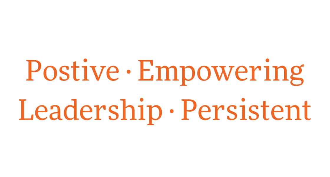
Brand personality
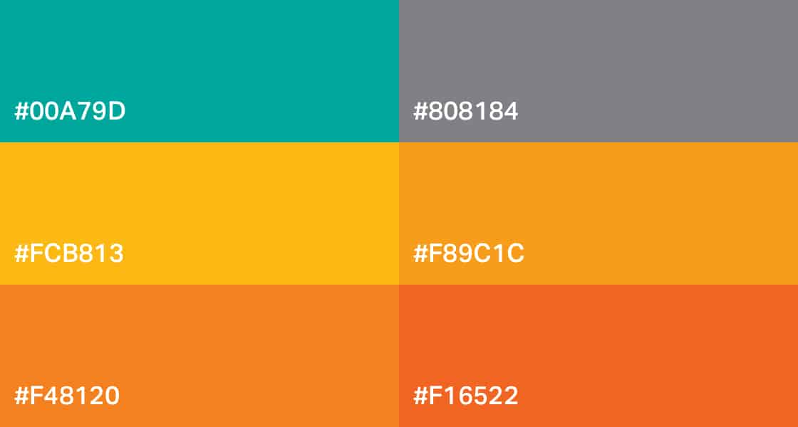
Colours
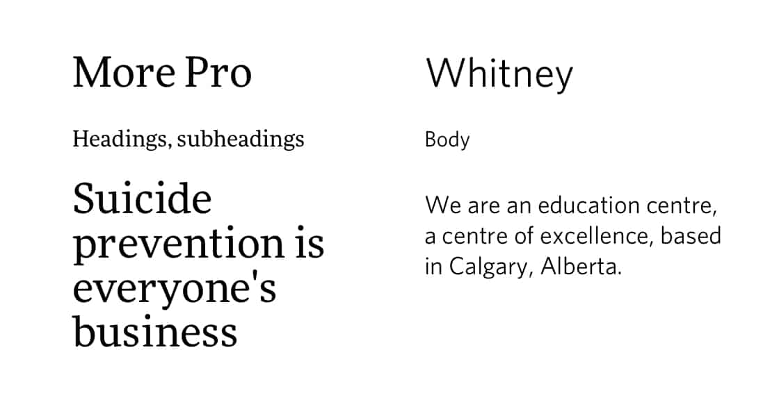
Typography
Logo
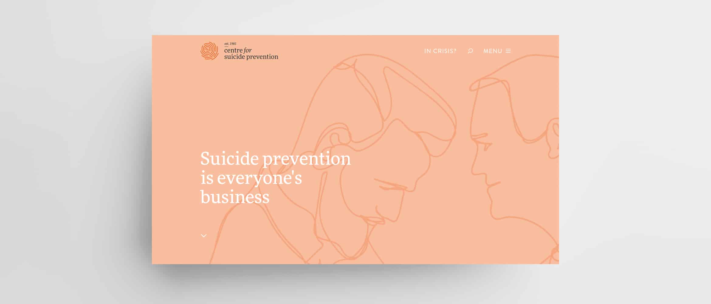
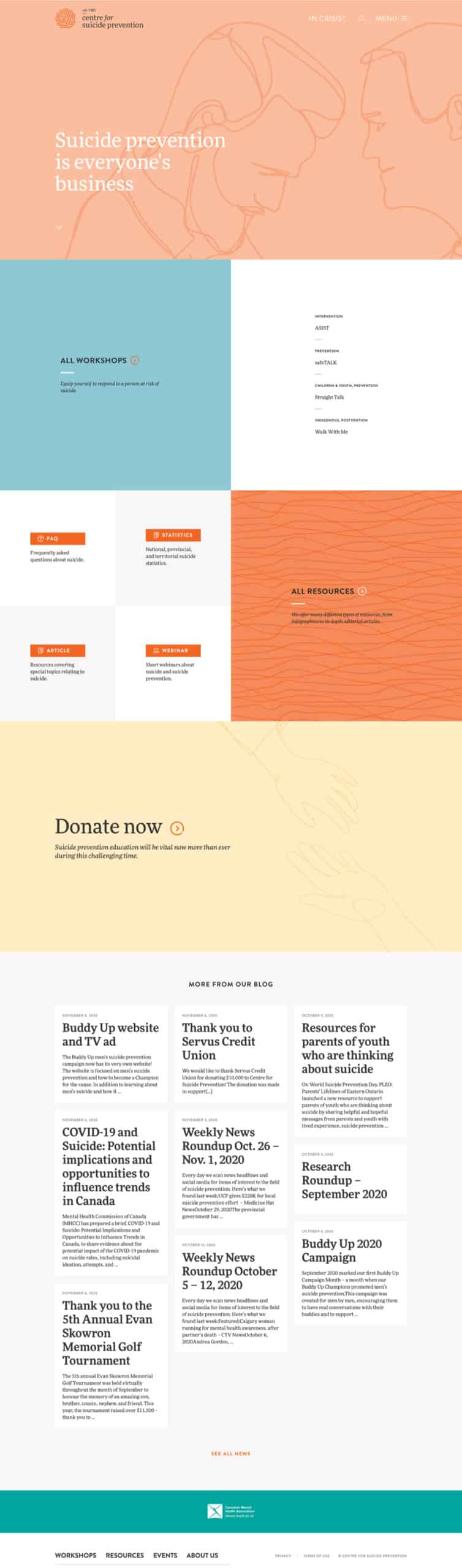
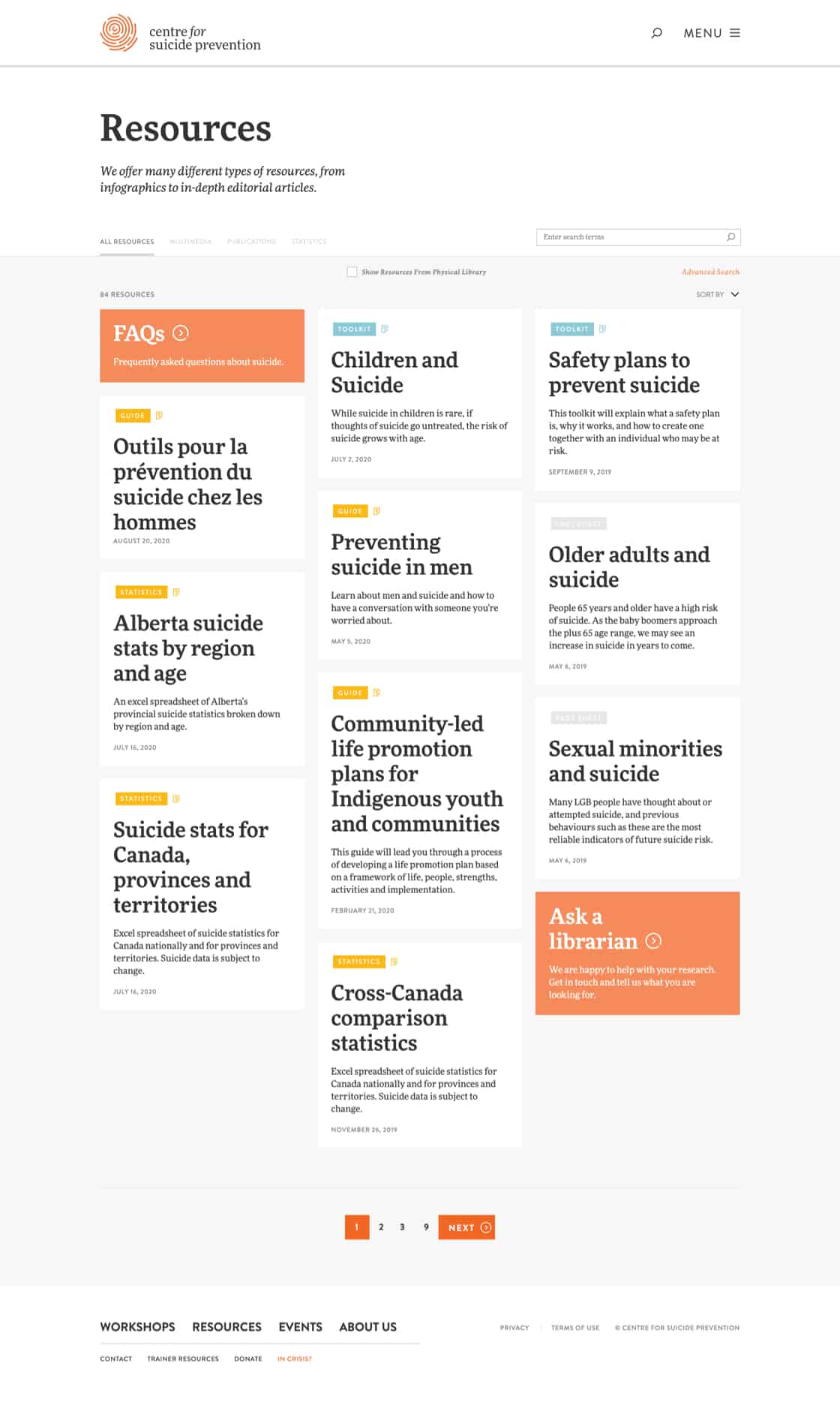
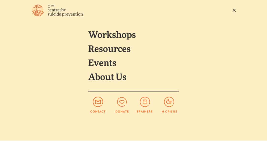
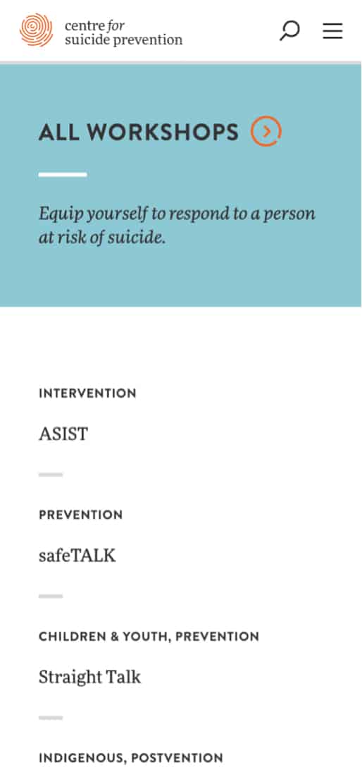
Website
An in-depth UX process arrived at a website that lets all users get to what they need quickly and easily. It includes a library of over 45,000 resources, a registration process for workshops, and a login area for trainers.
Illustrations
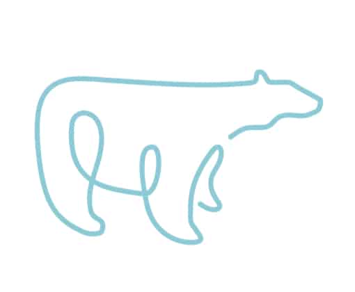
These illustrations are based on the idea of a thread connecting those who give help and those who need help in suicide prevention. Lines for each illustration are continuous.


Workshop icons
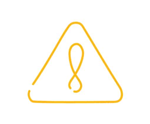
The ‘connecting threads’ motif continues with the workshop icons.


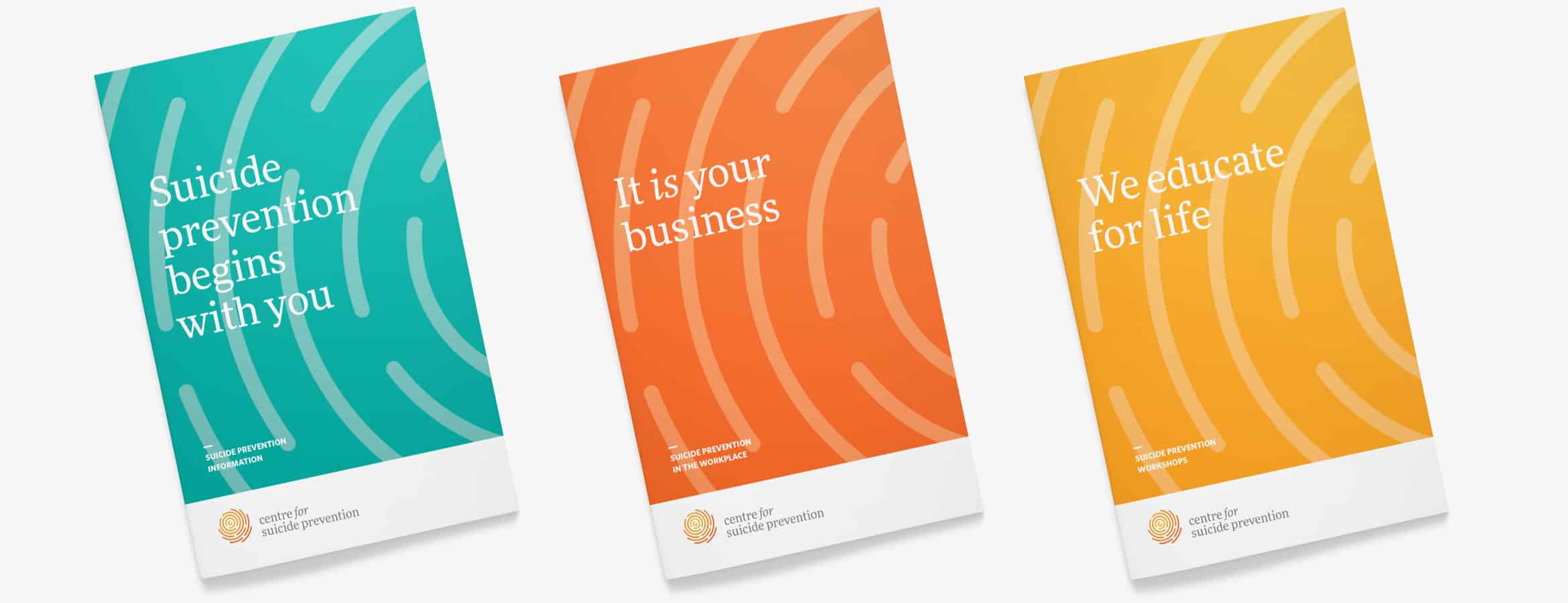
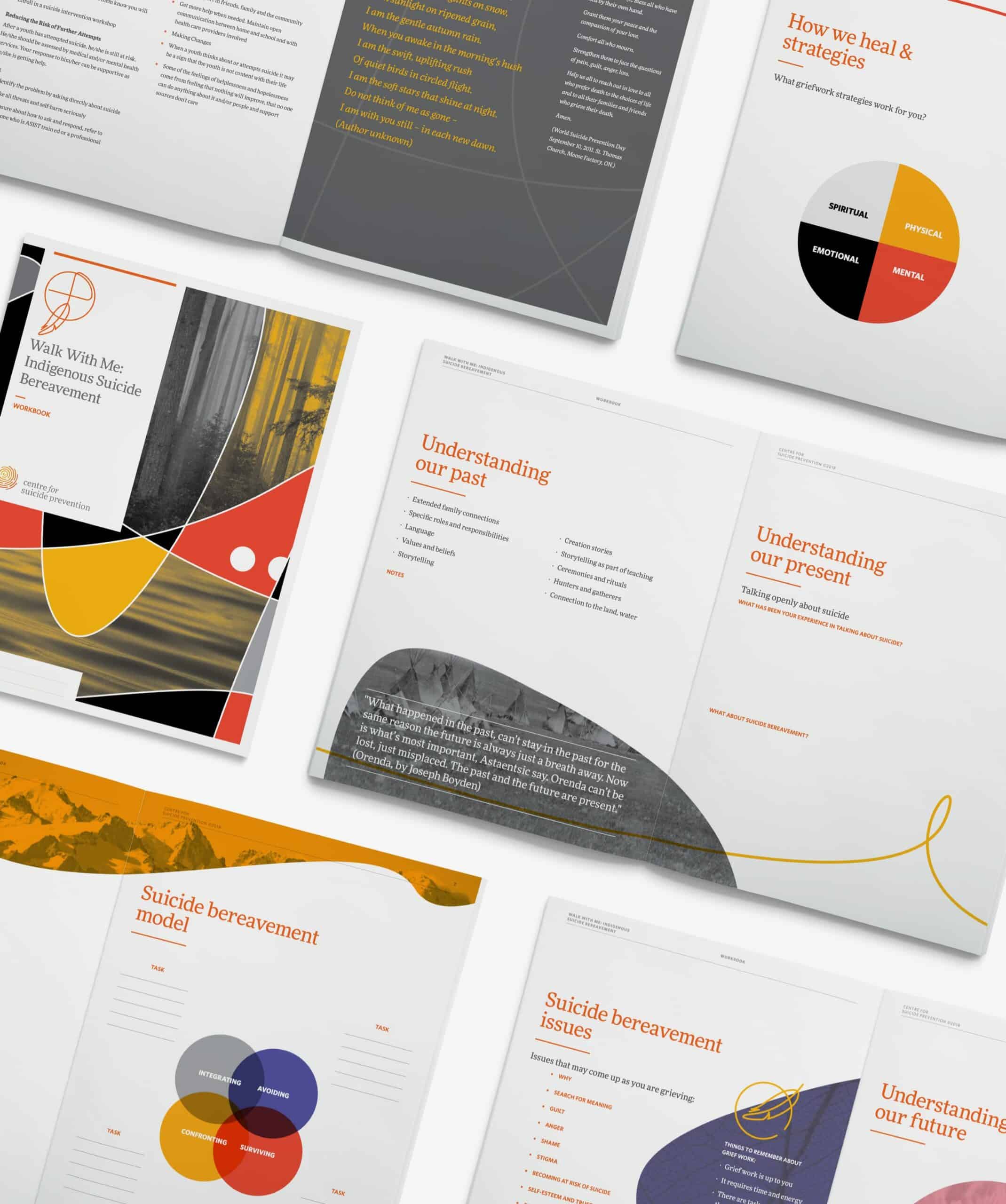
Brochures
The general, corporate and workshops brochures reinforce the brand and inform partners about what the Centre for Suicide Prevention offers.
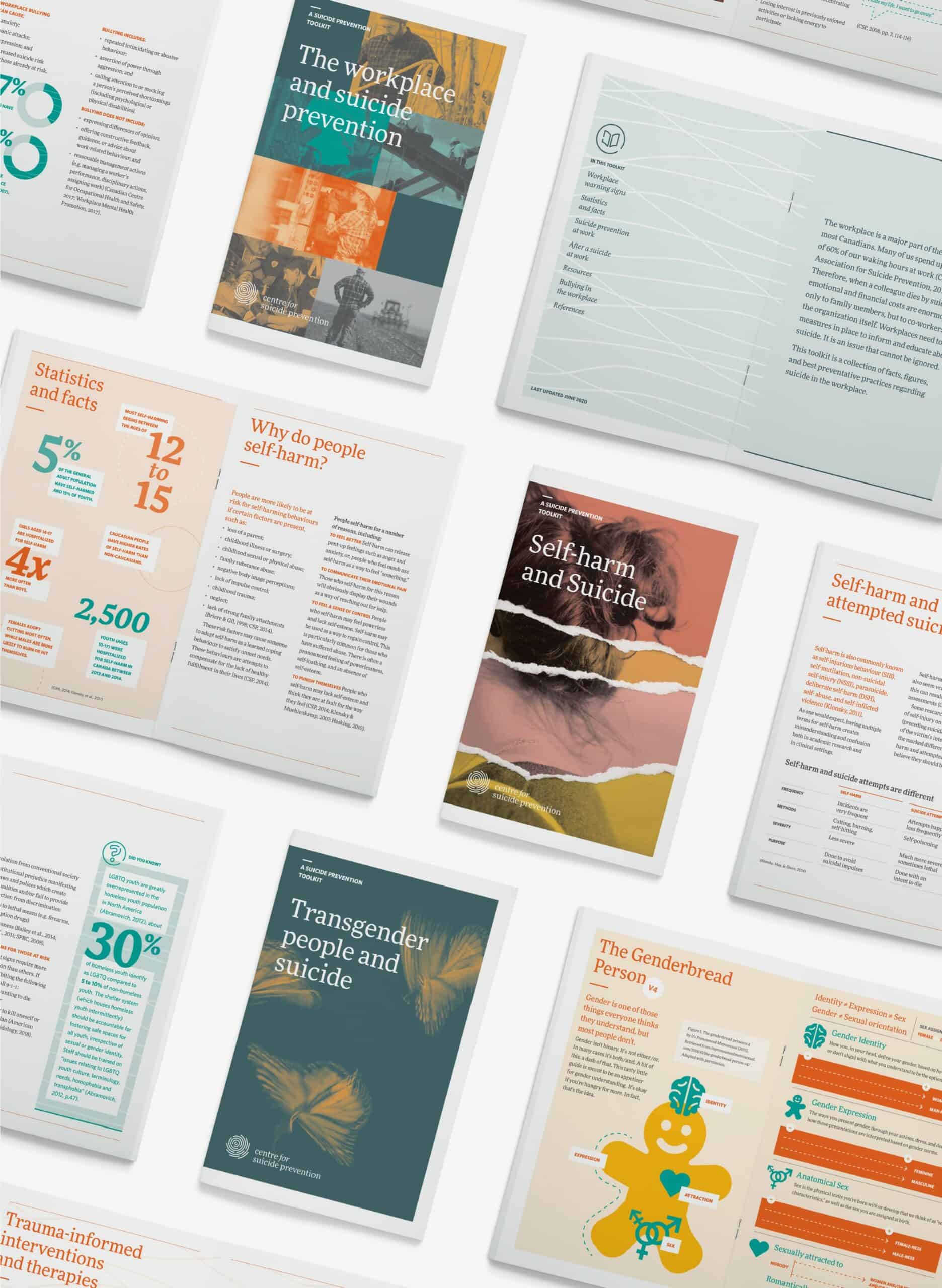
Toolkits
The Centre for Suicide Prevention produces toolkits based on the latest research, on a variety of suicide prevention related topics. These toolkits are available in print and PDF. The design lets each one have its own personality, while still staying on-brand.
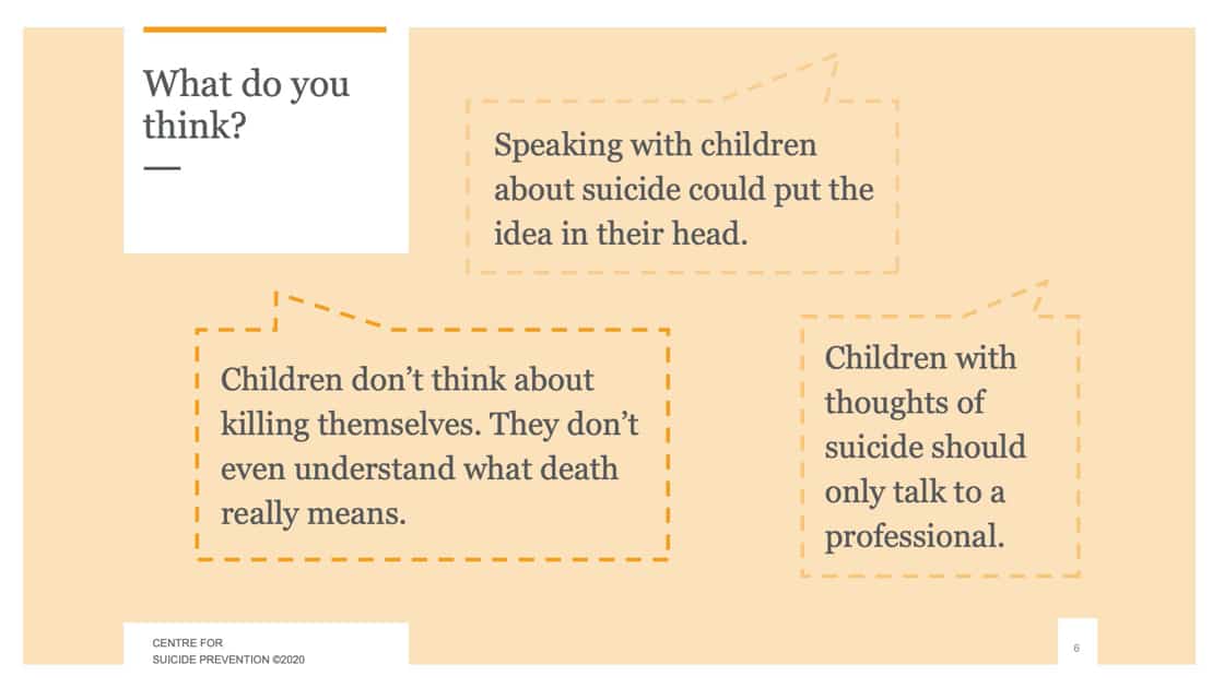
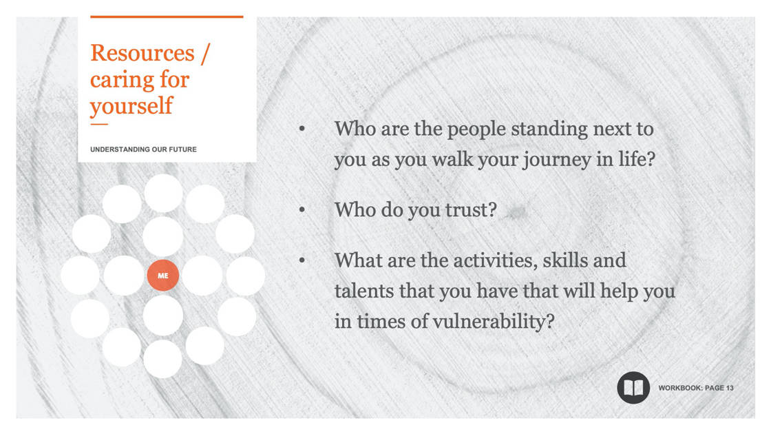
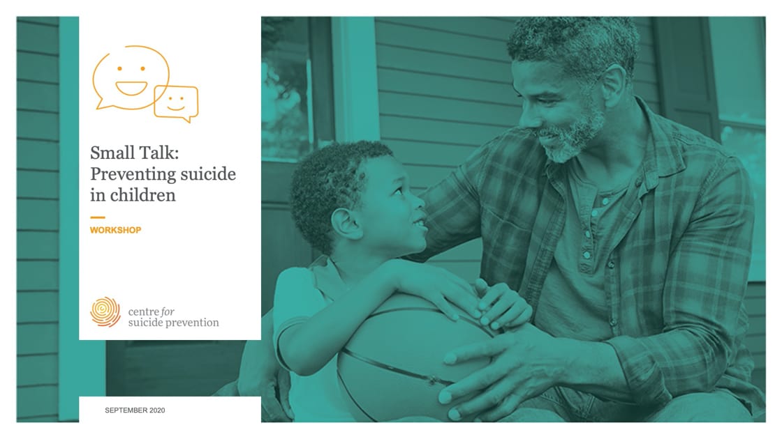
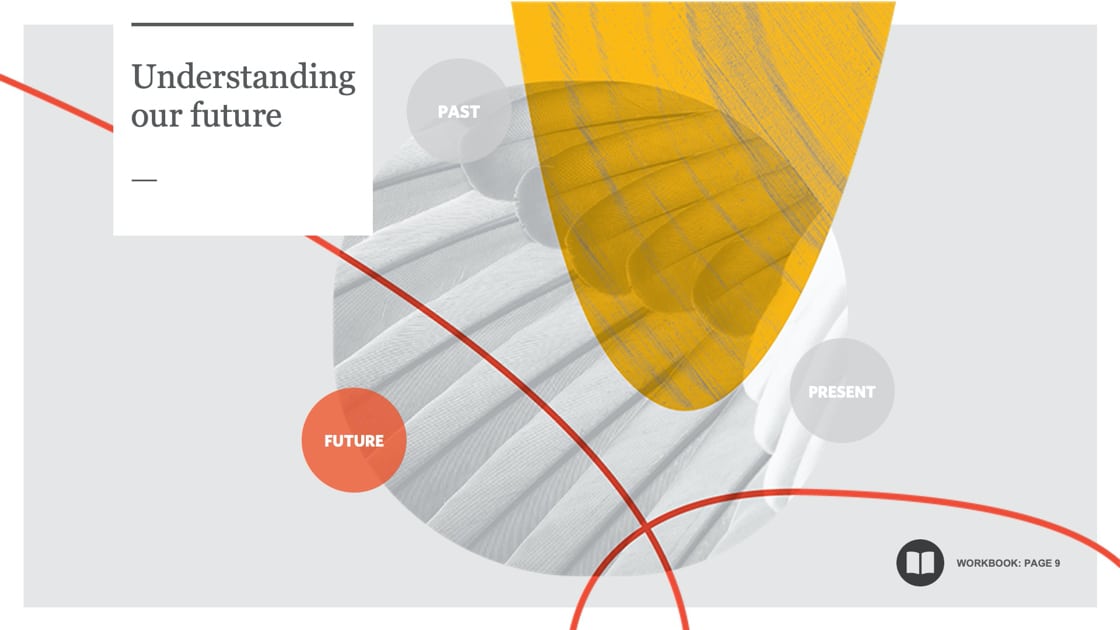
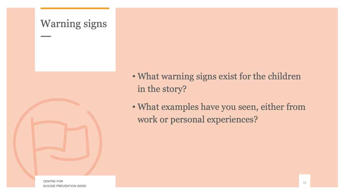
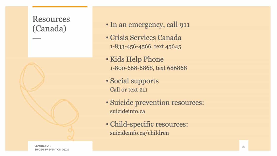
Workshop presentation slides
Workshops are memorable and effective when you have a good slide deck. We don’t include everything the presenter says, and instead summarize and highlight key points.
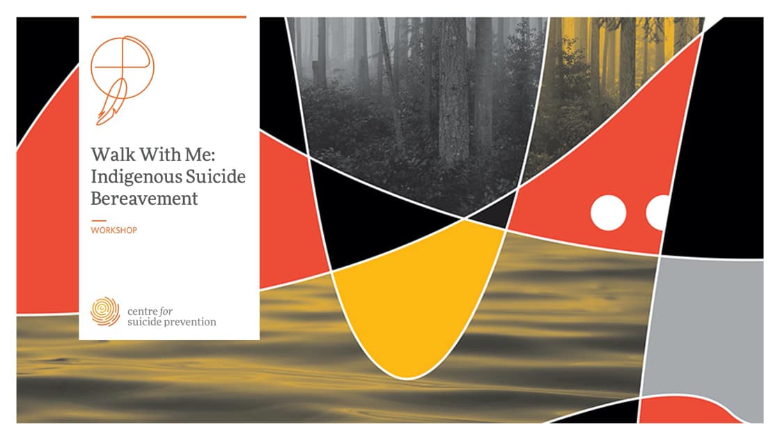
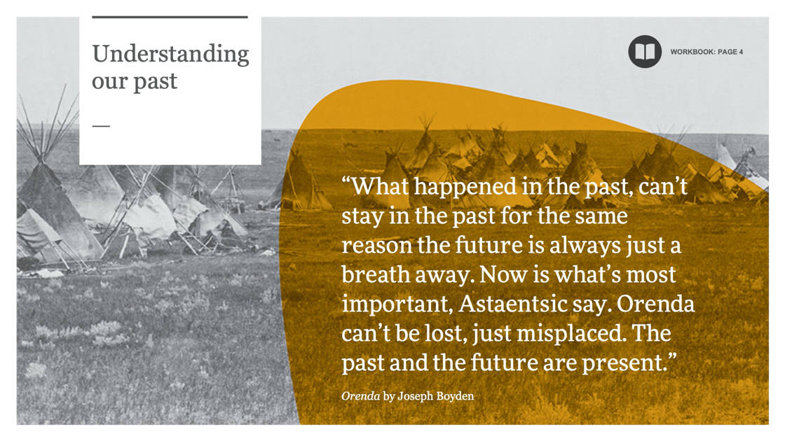
Participant workbook
A sub-brand was created for Aboriginal-focused materials like this one, for the Walk With Me program.
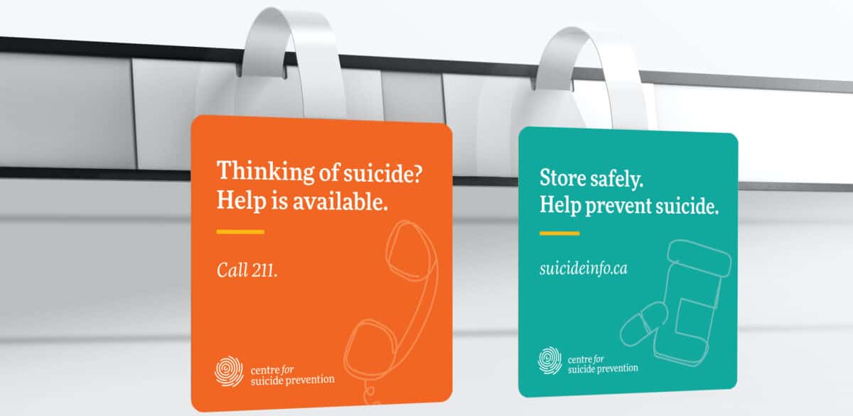
In-pharmacy messaging
Acetominophen is the most common method used to attempt suicide in Alberta. The Centre for Suicide Prevention is working on placing suicide prevention guides in key areas of pharmacies for staff, and also client-facing messaging such as these shelf-talkers.
Team
- Art direction: James Jensen
- Logo design: Morgan Curley
- Illustration & website design: Jessye Cook
- Design: Matthew Jacula, Chandra Vermeulen, Elmer Xavier