Taking a training company brand identity from industry standard to industry standout.
Challenge
Third Factor studies the science of performance across diverse disciplines to design learning experiences that help people perform, collaborate and lead in a disruptive world. They offer learning programs and keynotes. In addition to helping people in organizations perform at their best, they work with high performance athletes and apply
that learning to a broader context.
Third Factor had been operating since the 1980s under the name Performance Coaching. Over time, the name and brand started to feel generic, and became out of sync with what Performance Coaching was doing: focusing on developing resilience in people.
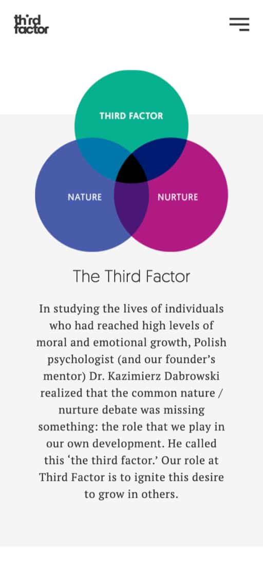
After a rigorous brand research and strategy process with brand strategist Robert Urbanowski, Performance Coaching came up with a new name: Third Factor. This name is based on the idea that most people only recognize two factors in a person’s development: nature and nurture. But there is a third factor, and that is the role a person takes in their own development.
It is at this point that Atom Studio was tapped to help create a visual brand that honours all the hard work put into the brand strategy.
Competitive analysis revealed that Performance Coaching’s logo and colours were not standing out in an increasingly crowded field. The new brand had to align with their personality: fresh, friendly, curious, candid, and real.
The logo was a key element of the new brand
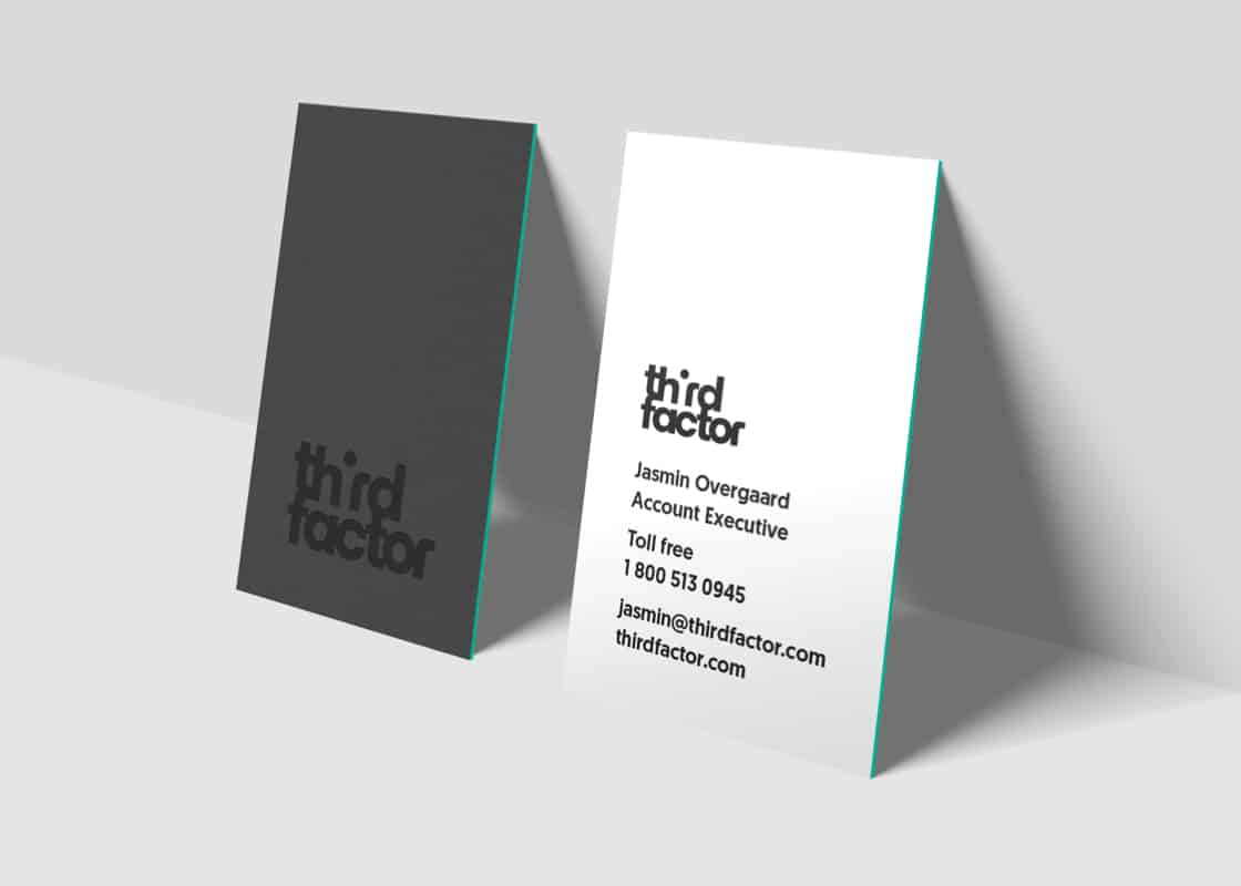
. We arrived at a design that is unlike their peers. The third letter is created with negative space, representing something initially unseen but essential. The dot on the i also makes this letter feel like a person, referring to personal development.
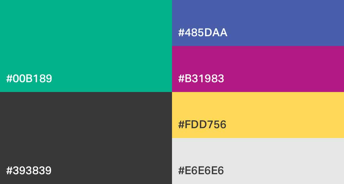
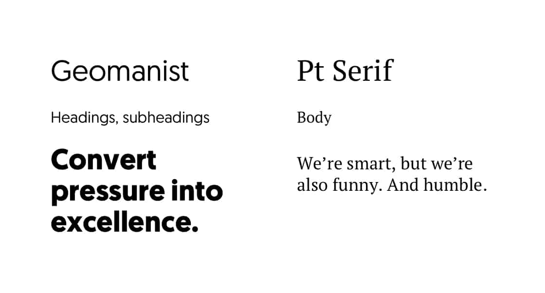
The visual brand uses a toolkit of shapes, colours and textures that can be easily re-combined in different ways to create new assets.
The website includes a flexible, module-based design that allows any new page to be built by combining modules in any order, and requires no design or coding skill to do so.
The rebrand was a large undertaking that involved the entire Atom Studio team and led to a very successful launch. The management and sales team at Third Factor, and their clients, love the new brand. Just as important, the new templates and systems make creating new materials easier, and ensure better design results.
Atom Studio elevated our brand from being a mainstream alternative to beyond a worthy contender, and now a regarded disruptor in our industry. They challenged us to articulate our brand to a higher level. Atom does not toe-the-line of the same old aesthetics or meet basic requirements and move on. They set us up for long term success with a real ability to translate brand strategy and brand positioning to give us an edge over our competitors. Atom Studio is a supercharger.
Jordan Lavin Marketing Lead, Third Factor
Brand personality
Colours
Typography

Logo
Website
The website includes a flexible, module-based design that allows any new page to be built by combining modules in any order, and requires no design or coding skill to do so.
Icons
This custom icon set is based off the circle motif established by the ‘i’ in the logo. The texture gives it a handcrafted, relatable feel. A toolkit of halftone patterns reinforces the Third Factor brand.
Document templates
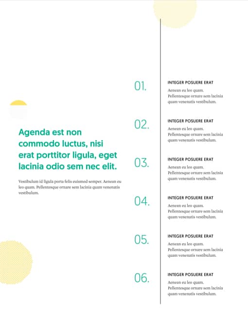
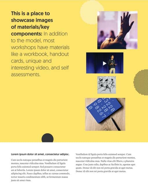
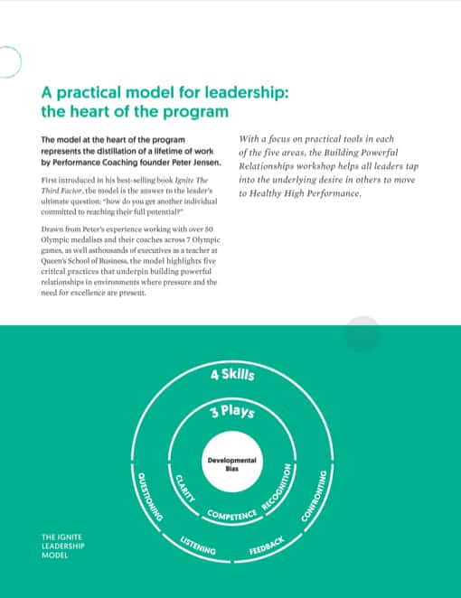
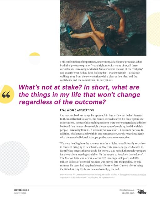
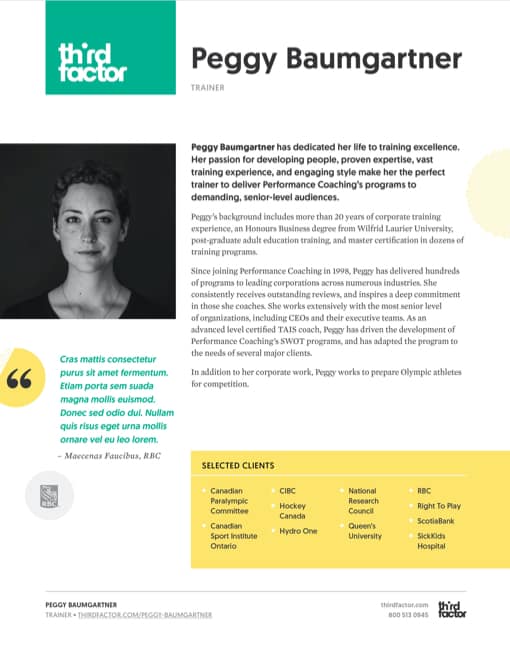
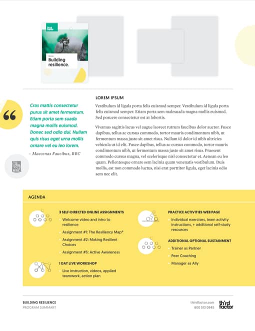
Third Factor produces many PDFs for marketing & sales. Atom Studio created page templates that are used for program summaries, bios, keynote descriptions, and case studies. They follow a consistent structure, so they can be combined in different ways to create custom pitches for clients.
Workbooks
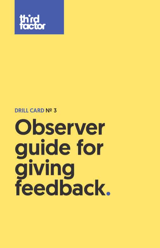
For the program workbooks, we designed clean, bold covers that communicate the program category (resilience, coaching, or collaboration) by colour.
Slide templates
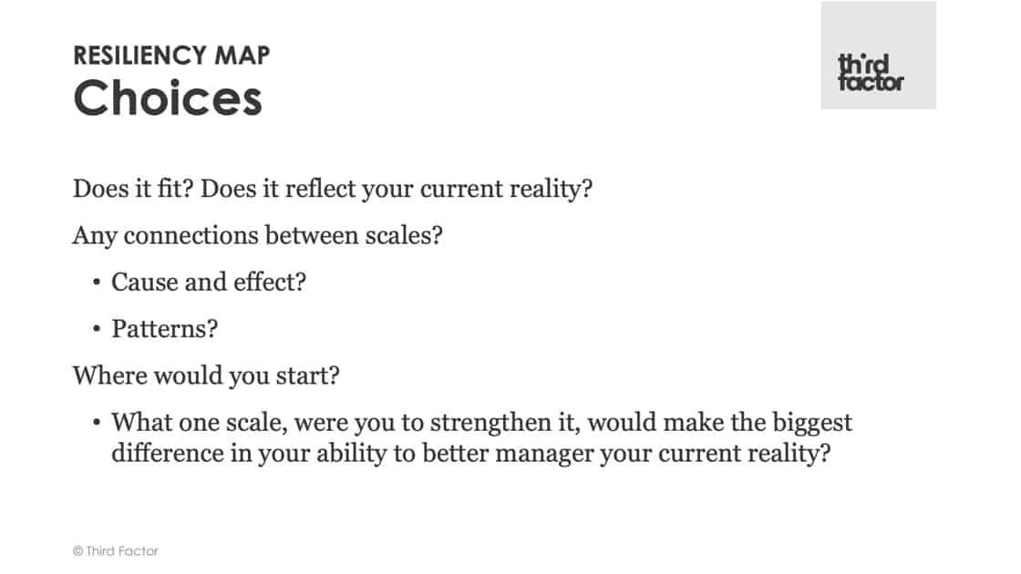
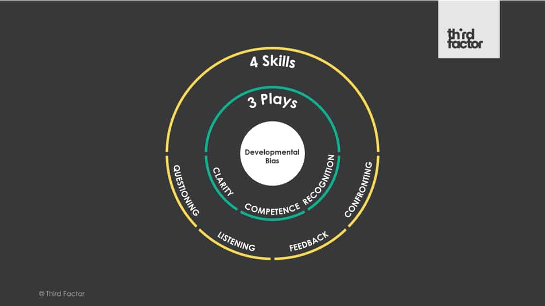
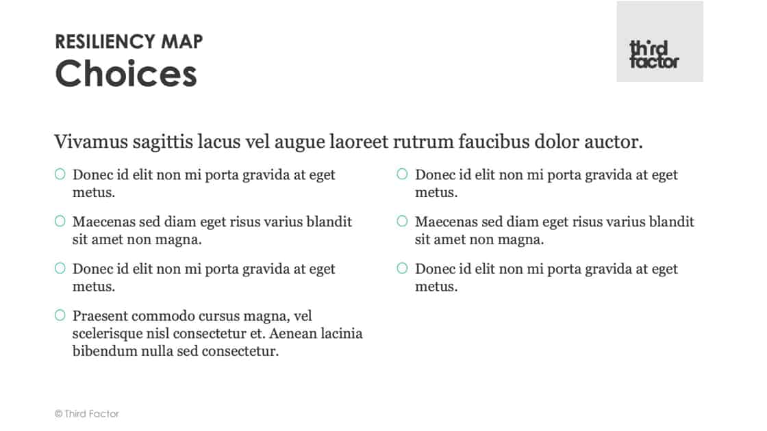
Making a killer slide deck is much easier when you start with good templates. We created enough layouts for any sales presentation.
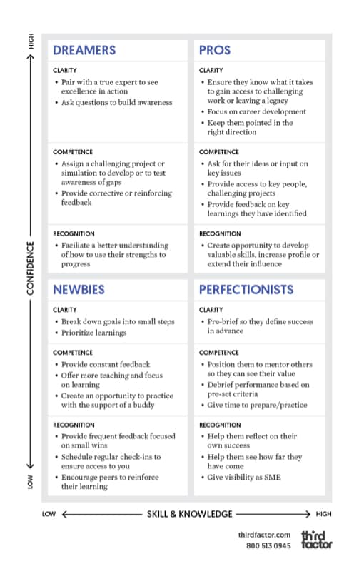
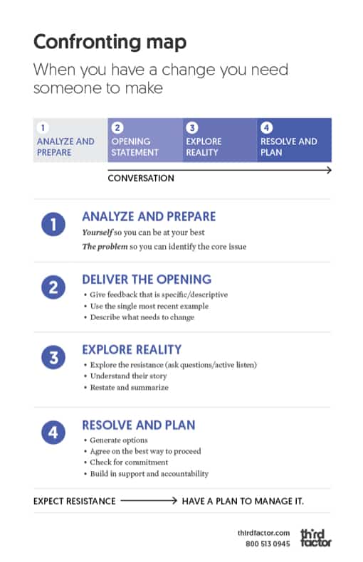
Skill & play cards
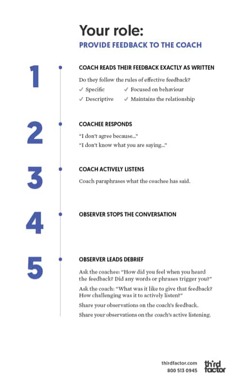
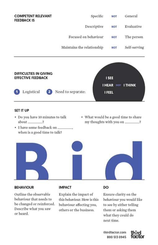
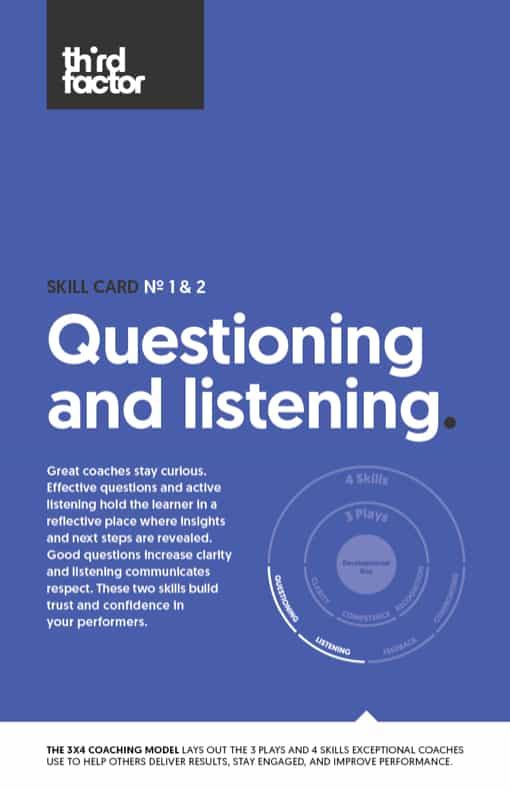
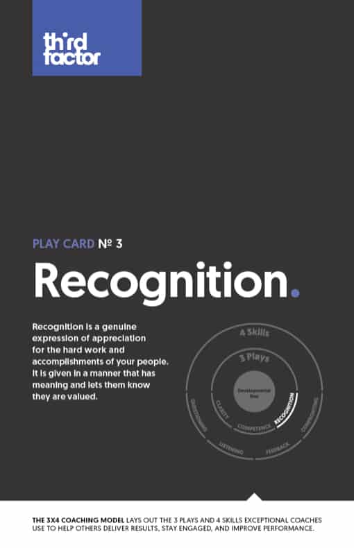
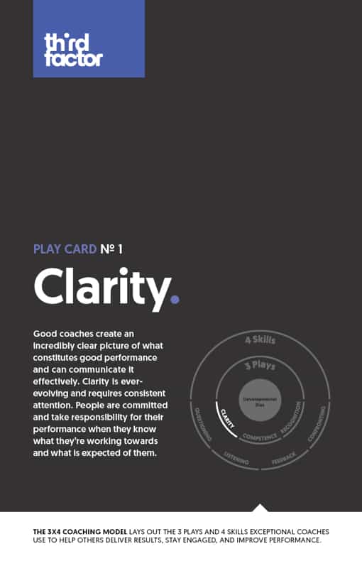
These 5.5″ x 8.5″ reference cards are given to program participants. They make the material easier to understand, remember, and put into action. Laminated on a sturdy stock, the cards can be kept on-hand for years.
Team
Art direction: James Jensen
Brand strategy: Robert Urbanowski
Design lead: Jessye Cook
Design: Chandra Vermeulen, Elmer Xavier
Big projects or small projects, we’d love to hear from you