Giobean
Brand identity & package design
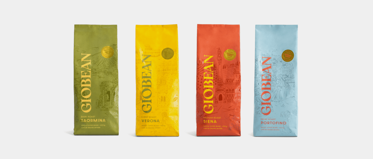
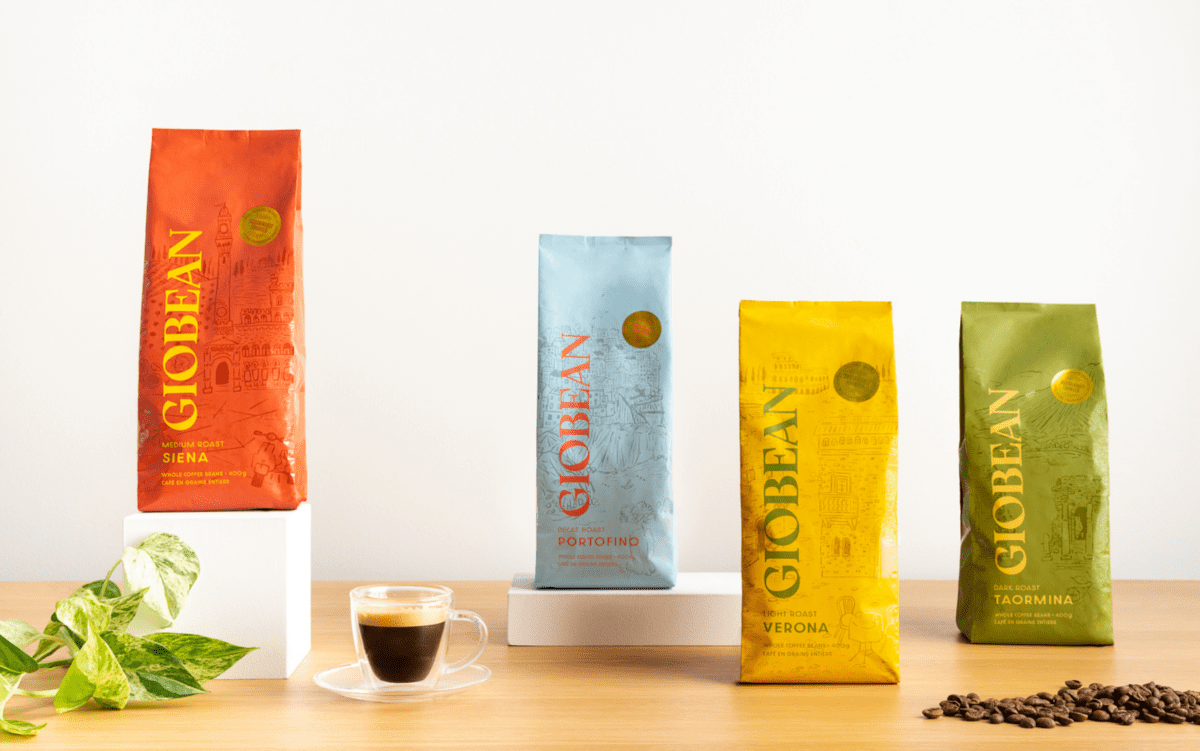
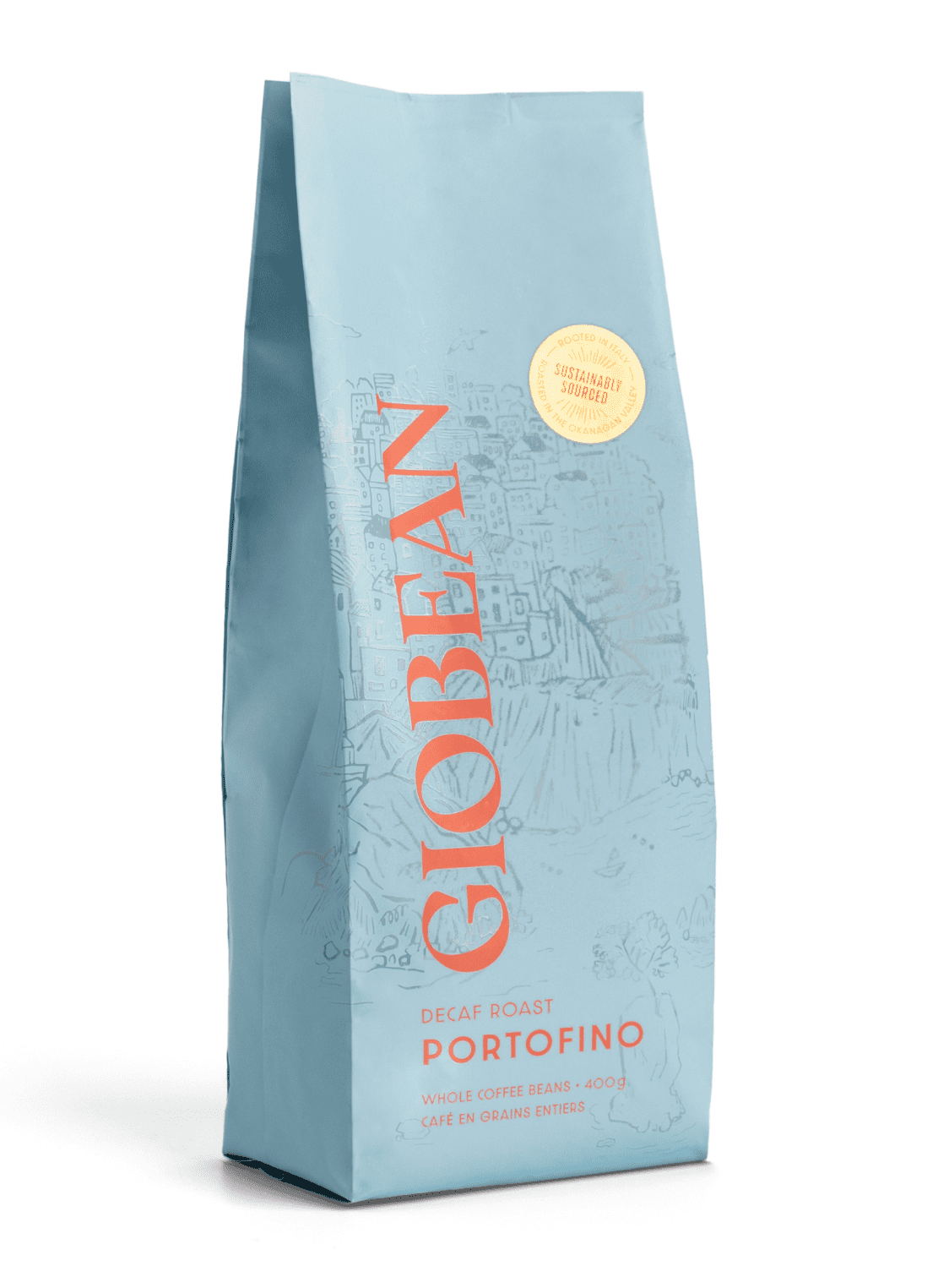
Package designs for a family-run coffee company that celebrate Italian tradition and shout from the shelves.
Atom Studio was very collaborative and guided us throughout the whole design process. Their ability to listen and understand what we wanted to achieve with our new look helped keep the design true to our company roots. They approached the project with a welcome and rare professionalism with ideas and creativity that were far beyond what we had hoped for.
Lucy Lauretta
Co-founder, Giobean
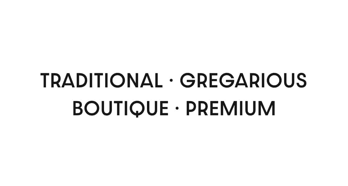
Brand personality
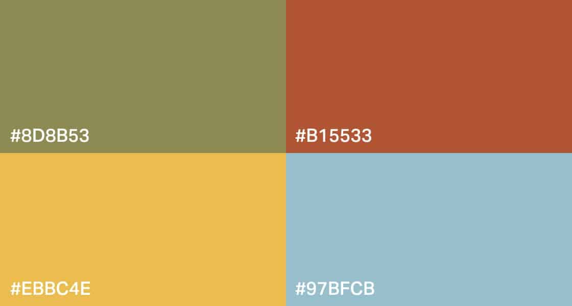
Colours
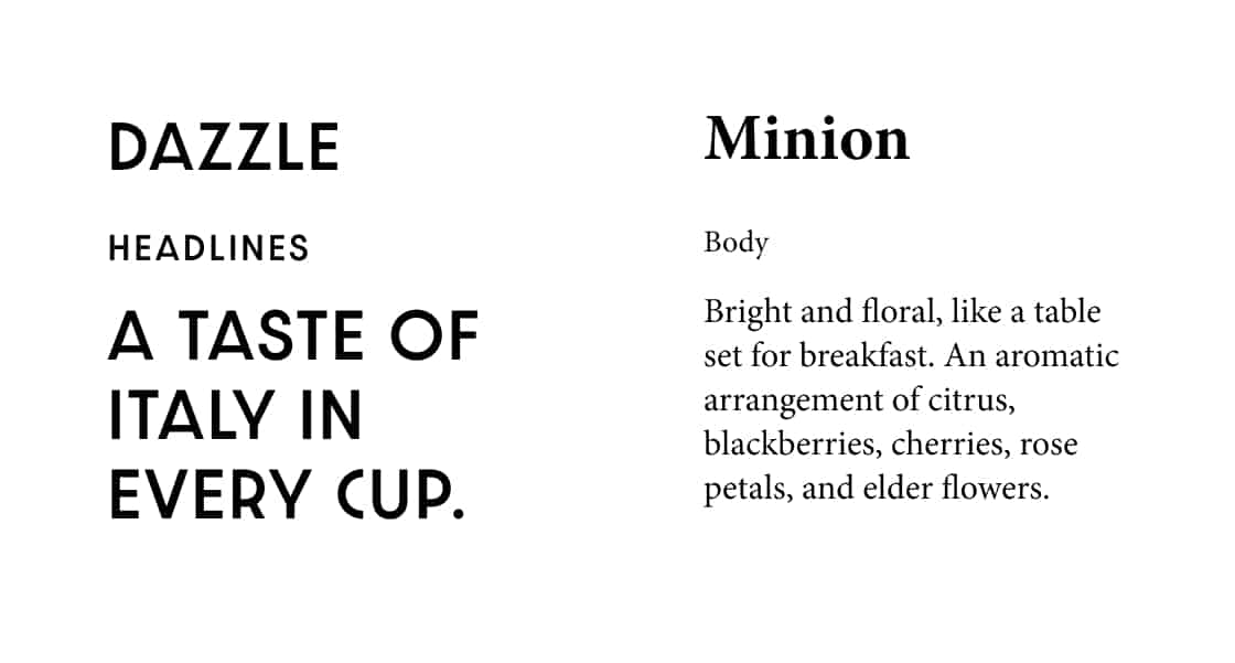
Typography
Logo
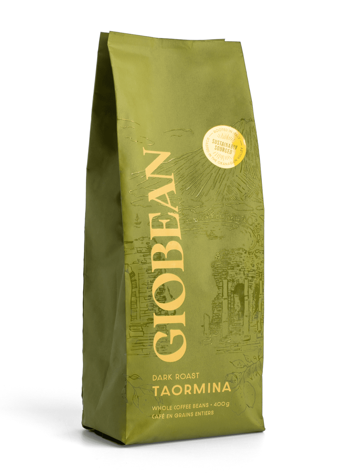
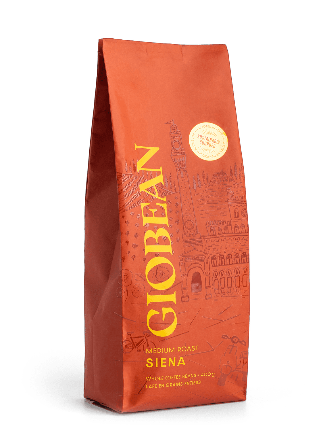
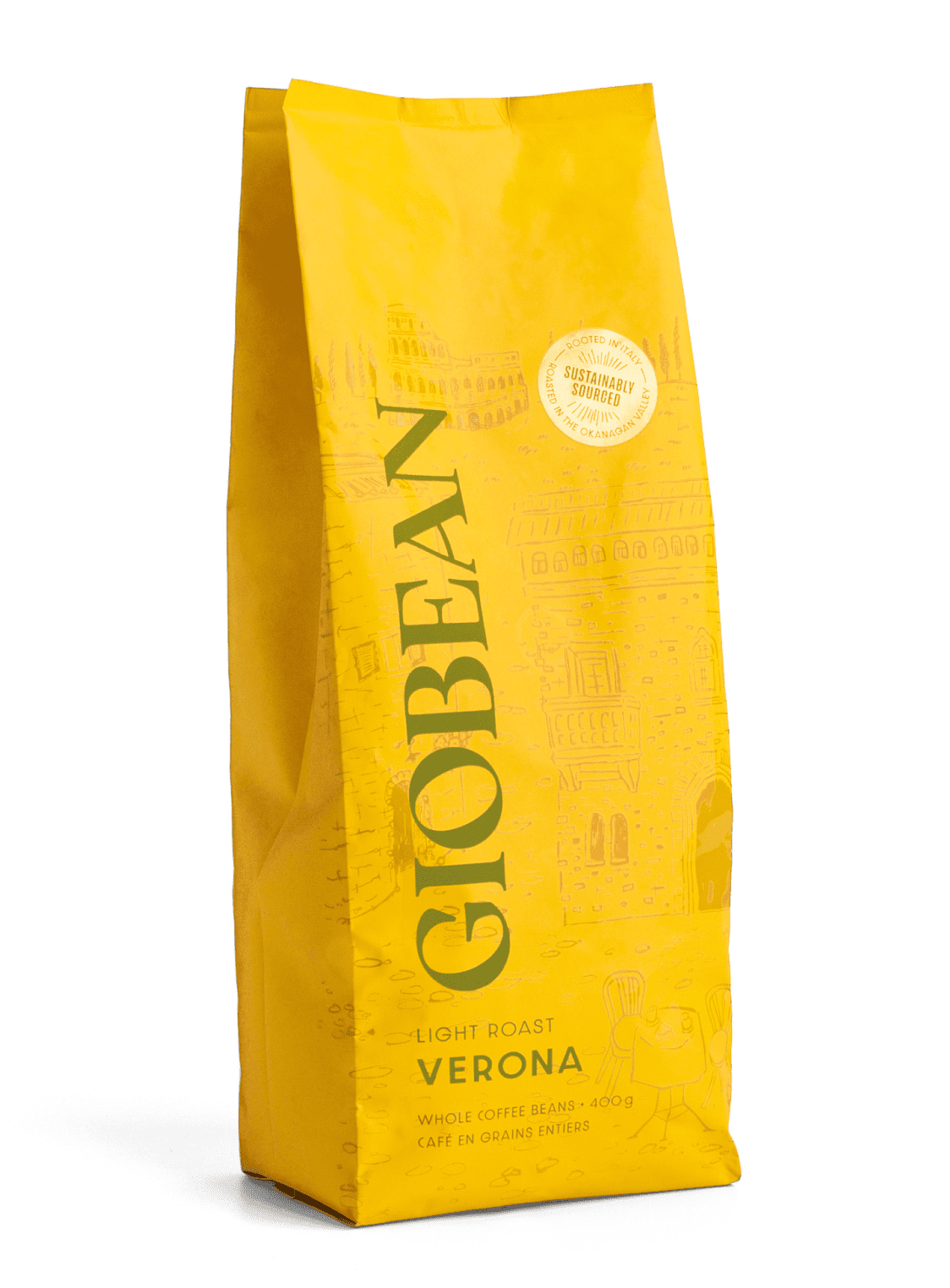
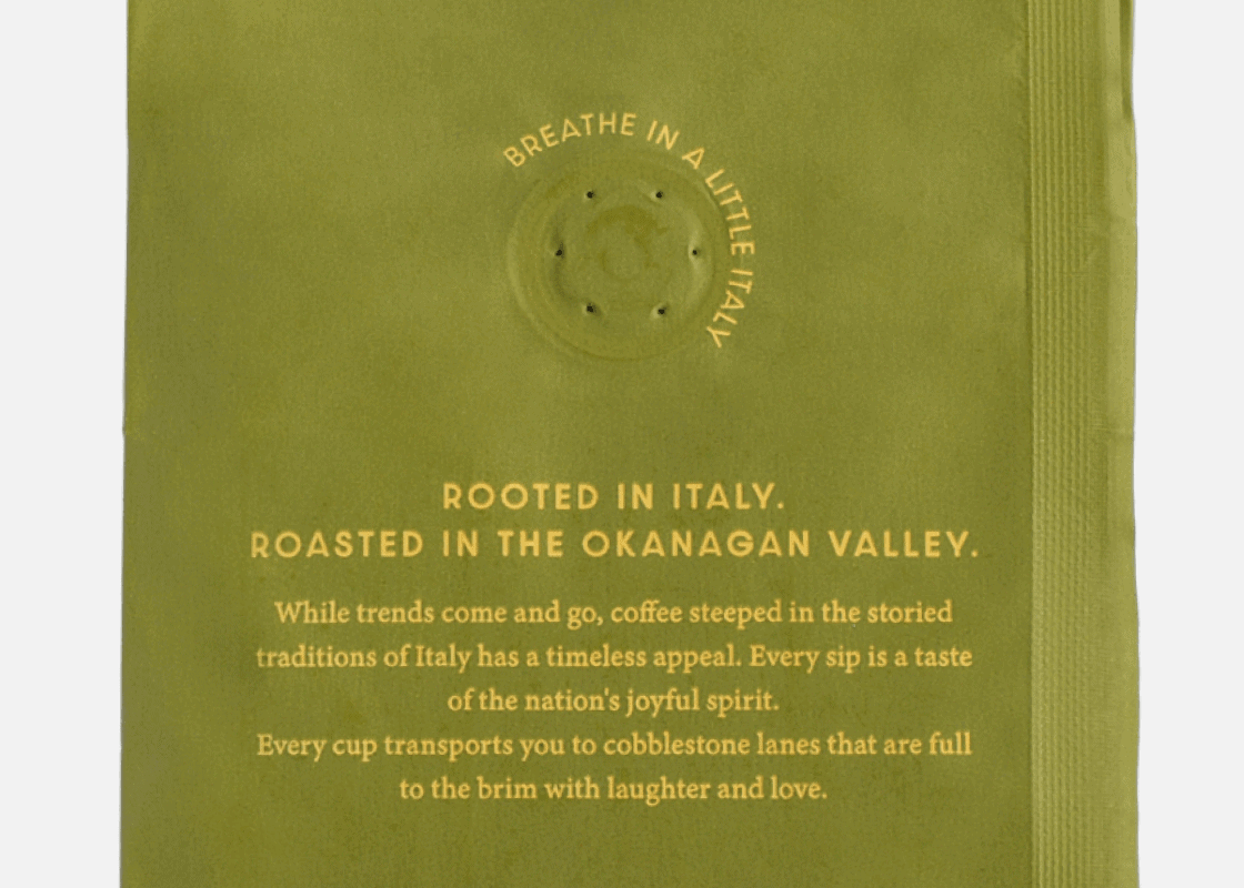
Package design
Custom illustrations capture nostalgic scenery from well-known Italian locations.
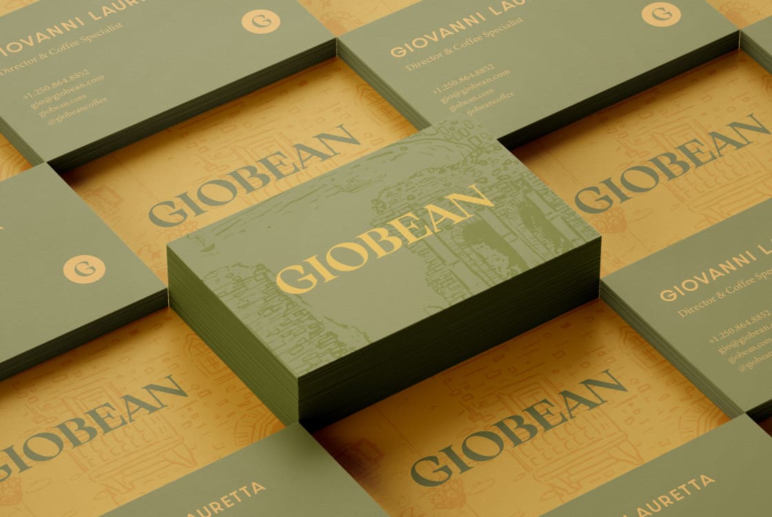
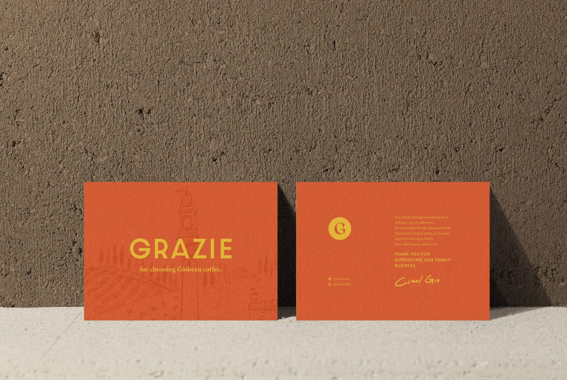
Brand collateral
We created business cards and thank you cards with illustrations used for the packages with unique messages to add the Giobean’s brand personality. The rich, subtle ingredients of the Giobean brand were adapted for premium print collateral as well.
Team
- Art direction: James Jensen
- Logo design: Matthew Jacula
- Illustrations & package design: Kagari Kaneoka
- Project management: Evonne Tran
- Writing: Anders J. Svensson