ProStar Restoration
Website and handbook
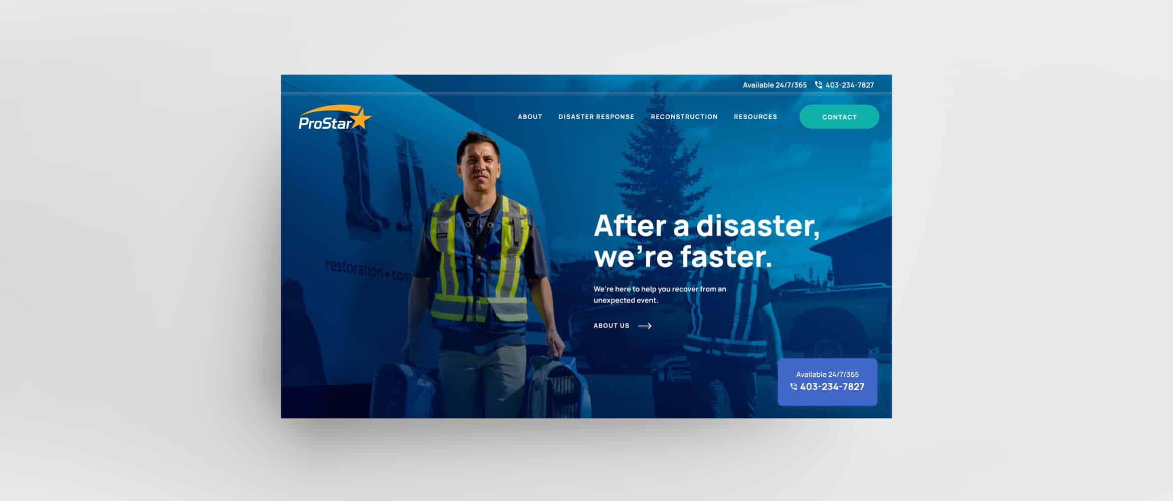
A restoration company claiming their leadership position with an expansive website that covers all the bases.
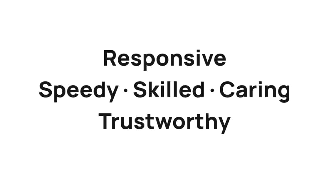
Brand Personality
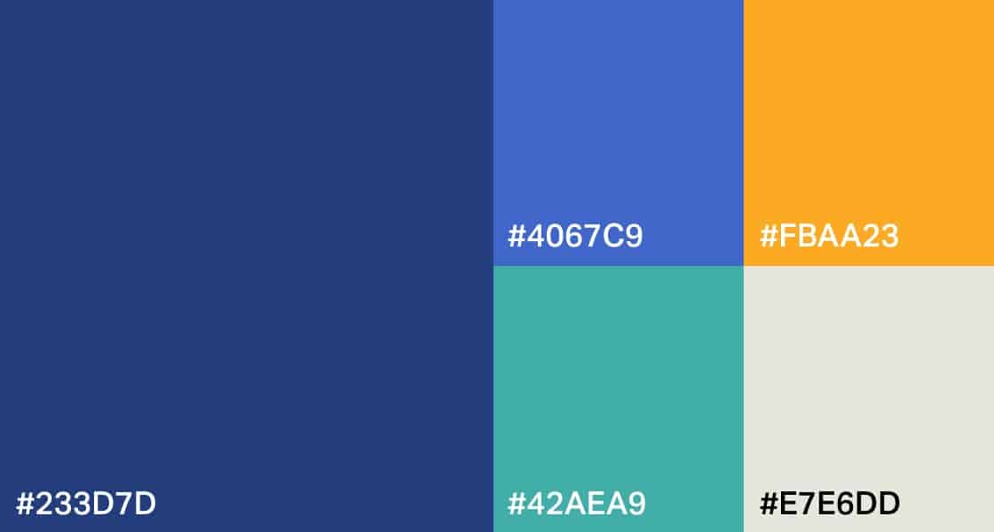
Colours
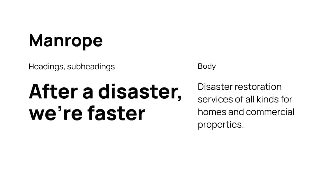
Typography


Tagline
Website
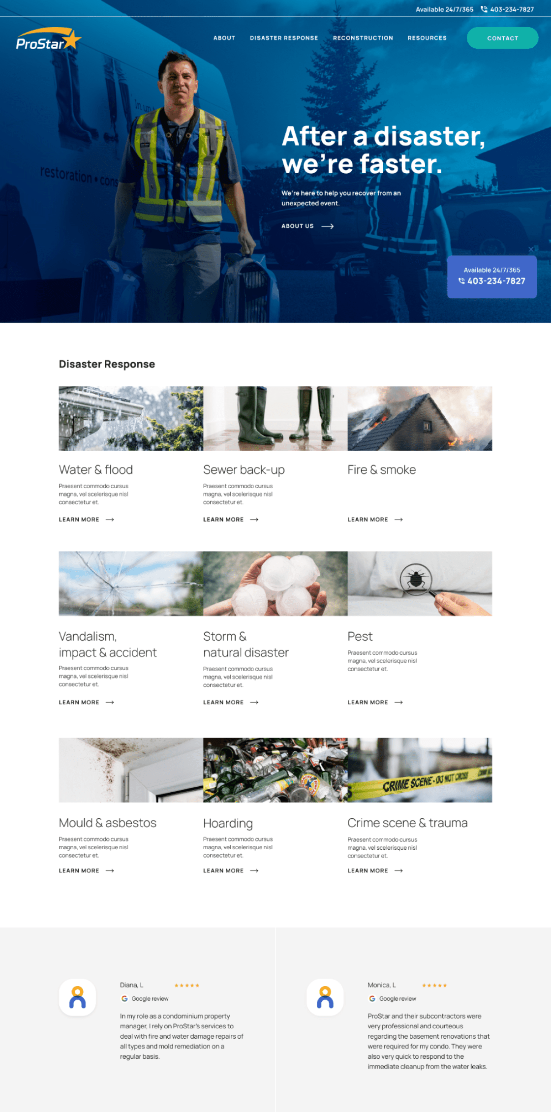
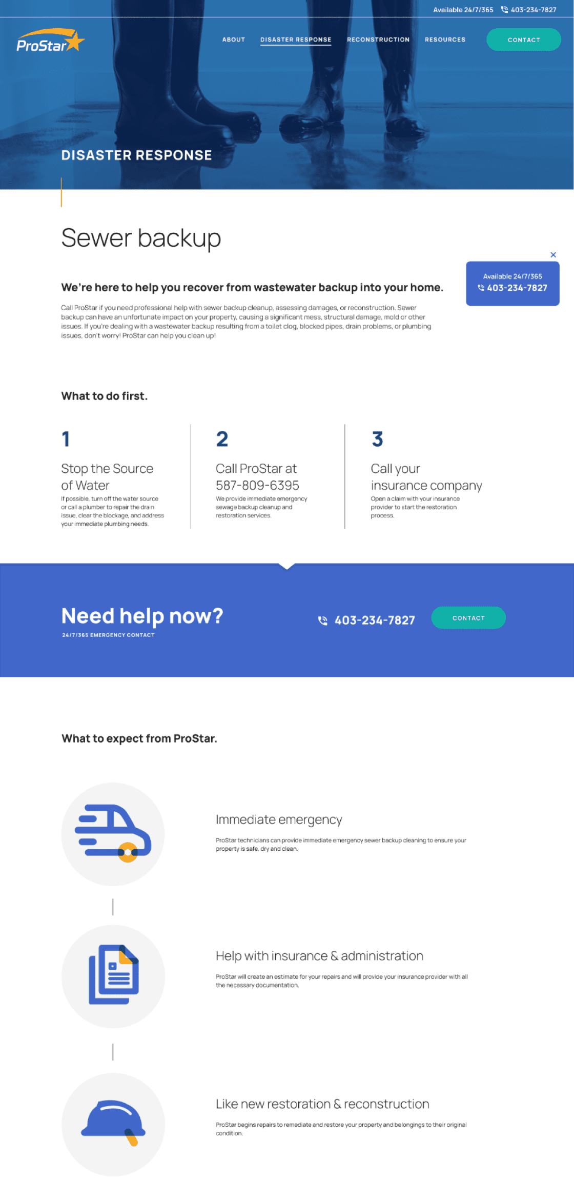
The website incorporates custom photography to showcase ProStar’s workers in a confident and empowering manner. The use of ample whitespace allows for a clean, organized presentation of information, making it easier for users to digest.

Icons
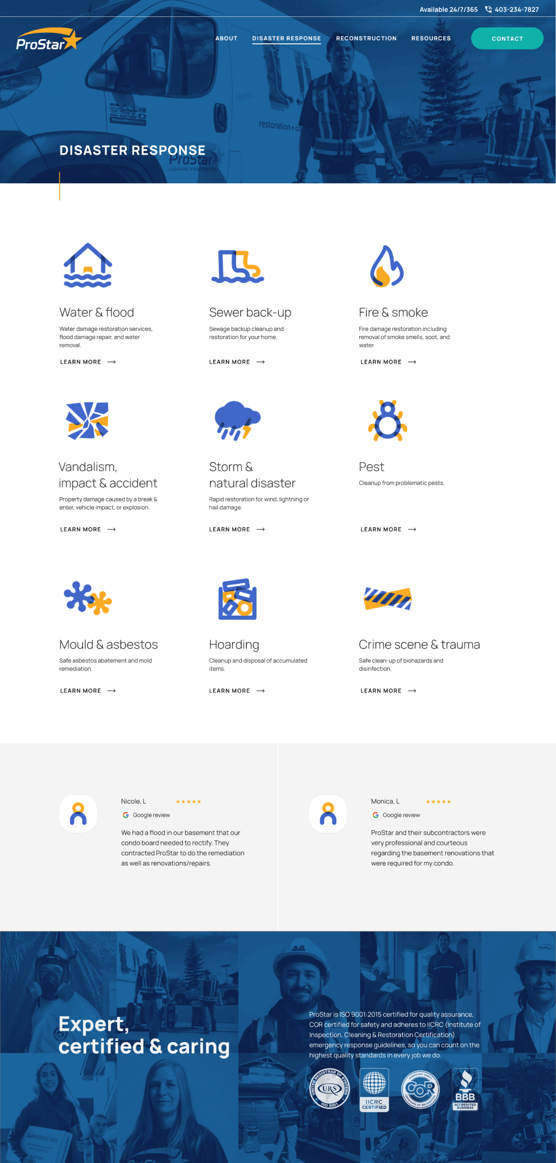
Custom icons using ProStar Blue and ProStar Yellow were created to communicate the variety of services offered in the Cleaning/Restoration business, with the main feature being the overlapping treatment that emphasizes the brand keywords of cleanliness and transparency.


Handbook
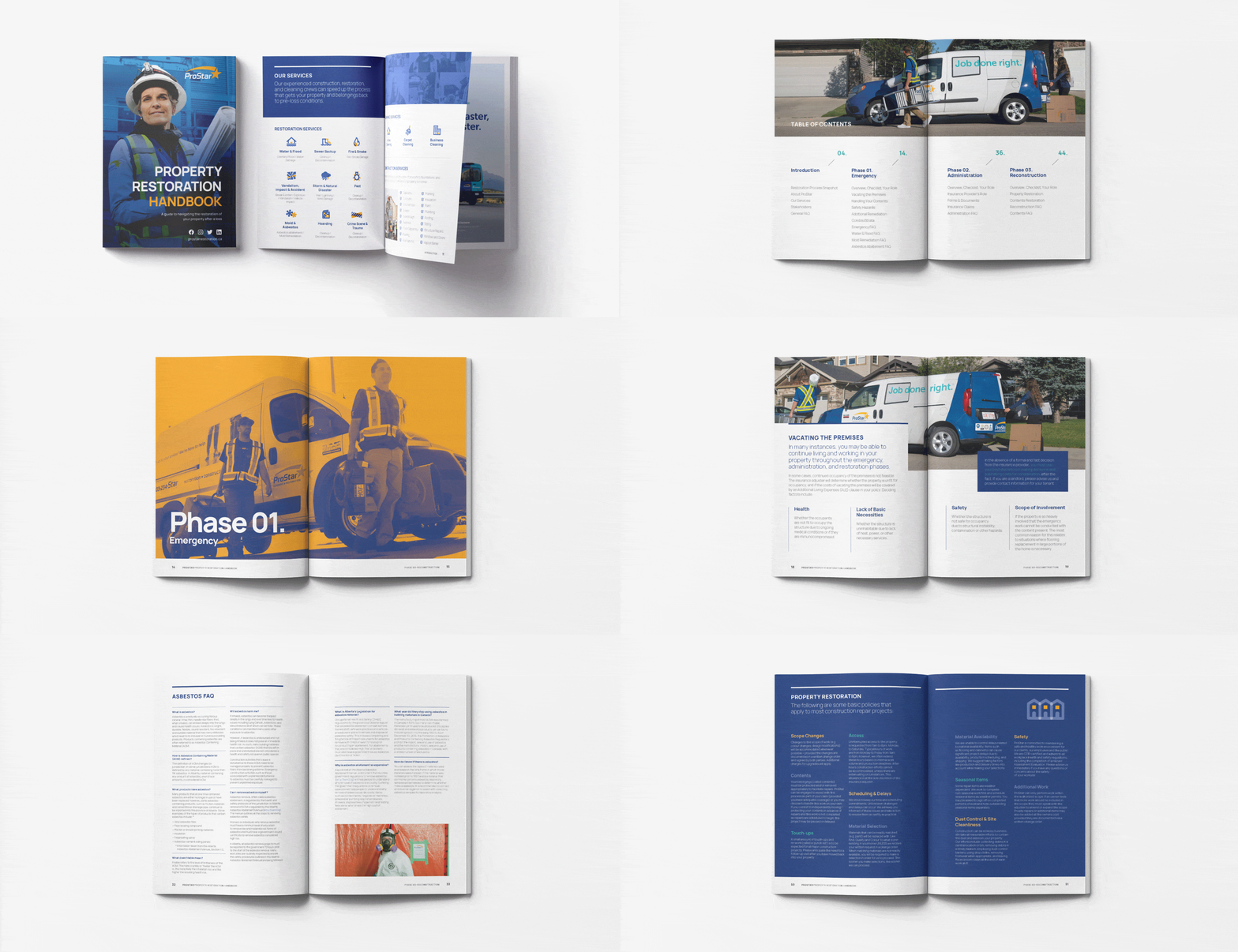
We helped refresh ProStar Restoration’s handbook by incorporating visuals and photography that align with their new brand identity, as established through the design direction of their website. This helped guide customers through their restoration journey in a visually appealing and easy-to-follow manner.

Team
- Art direction: James Jensen
- Design: Kagari Kaneoka
- Development: Jennifer Leigh
- Project management: Evonne Tran
- Strategy: Robert Urbanowski
- Photography: John Gaucher
- SEO: Konstruct

