Remuda
Brand identity & website
Taking a post frame building company to the next level.
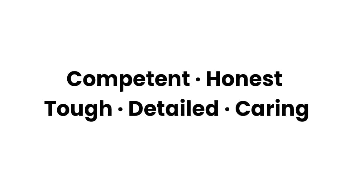
Brand Personality
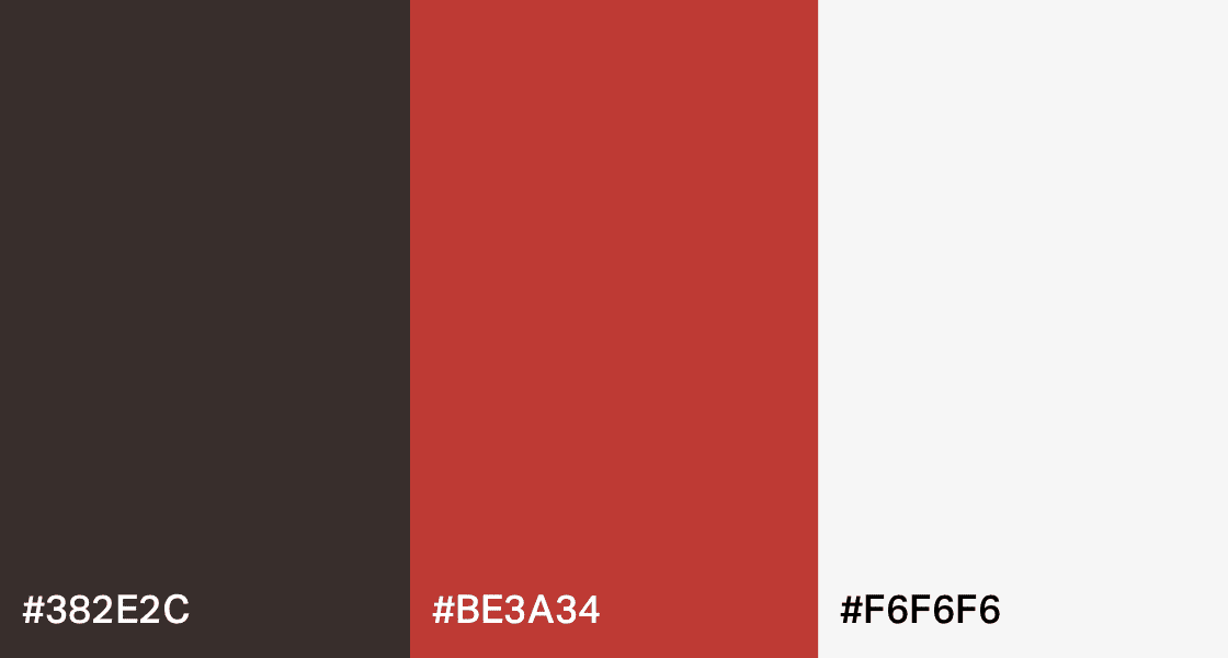
Colours
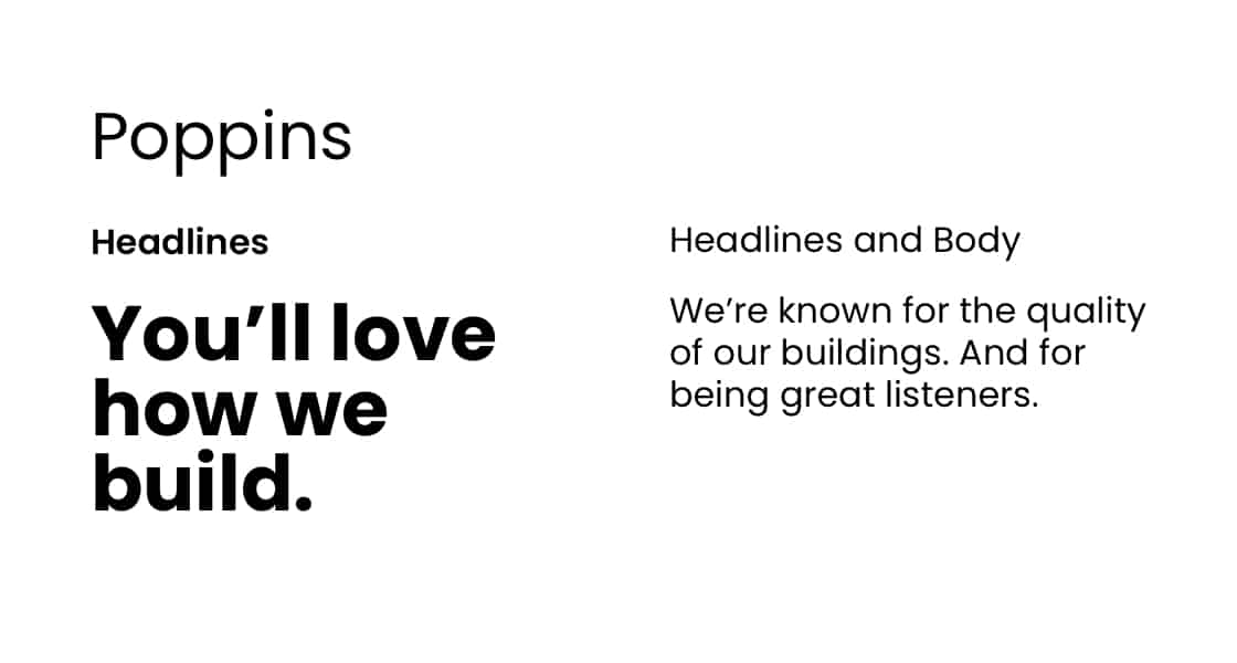
Typography
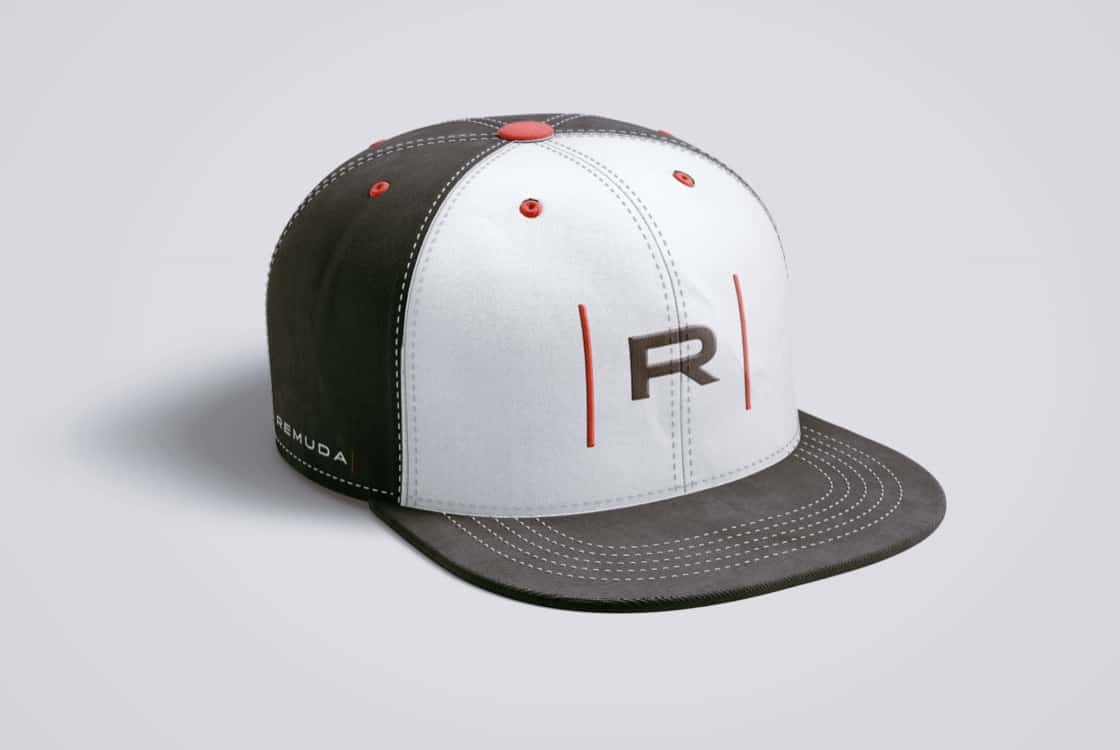
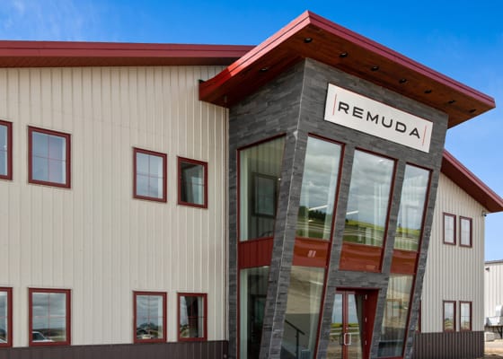
Logo
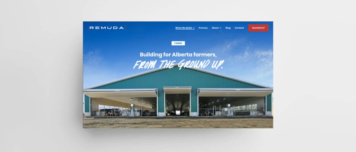
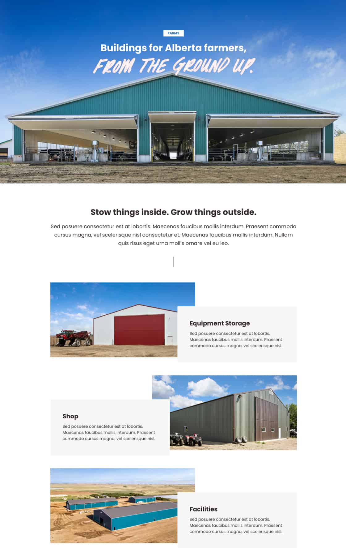
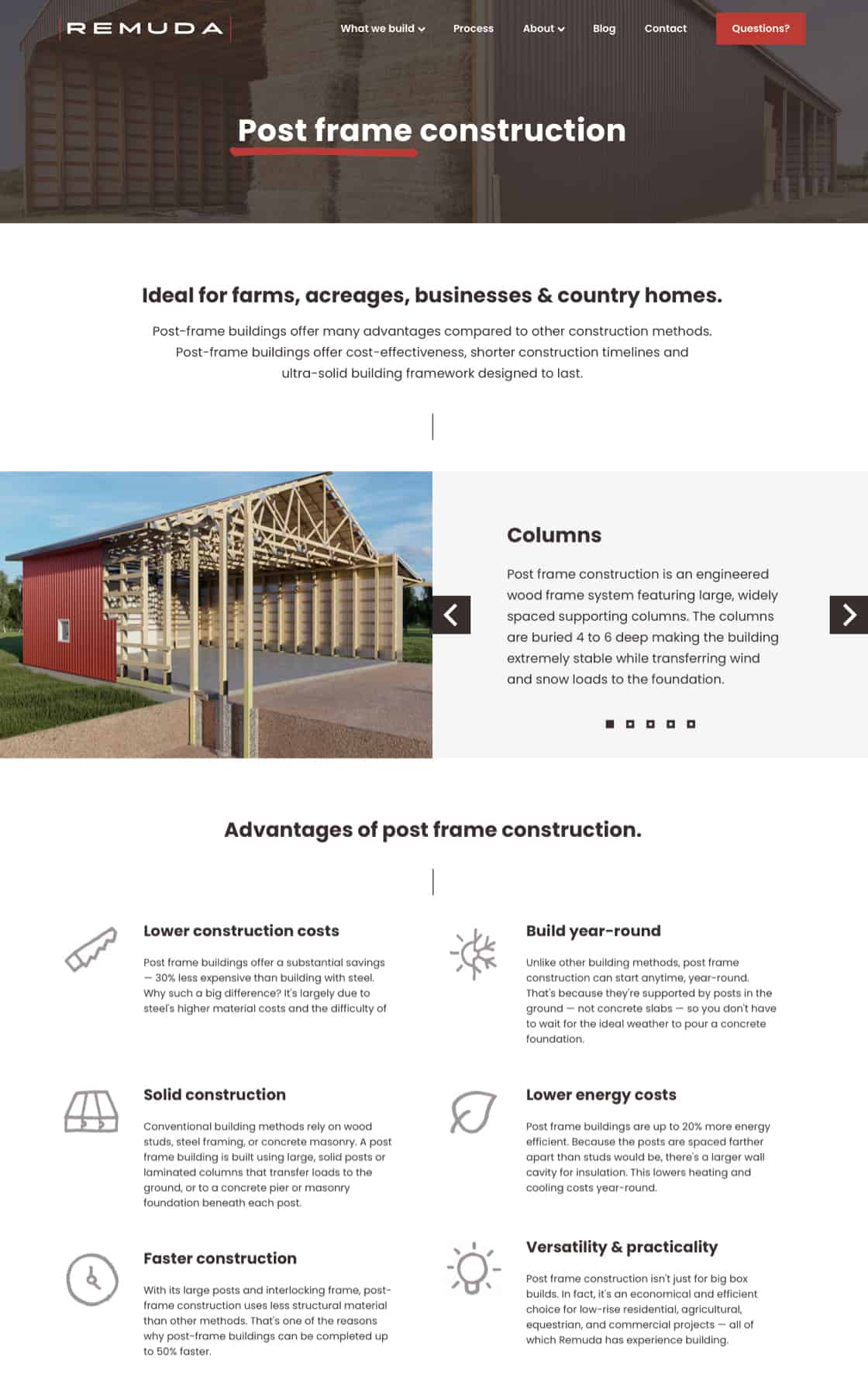
Website
Building projects can be complex, but we showed how it can feel simple. The site gives the information you need, and nothing you don’t.

Hand lettering & icons
We used real handwriting – not a purchased font. Remuda has a typeface, and icon sets, unique to them.


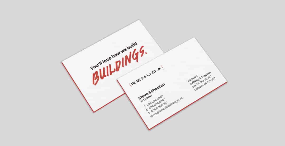
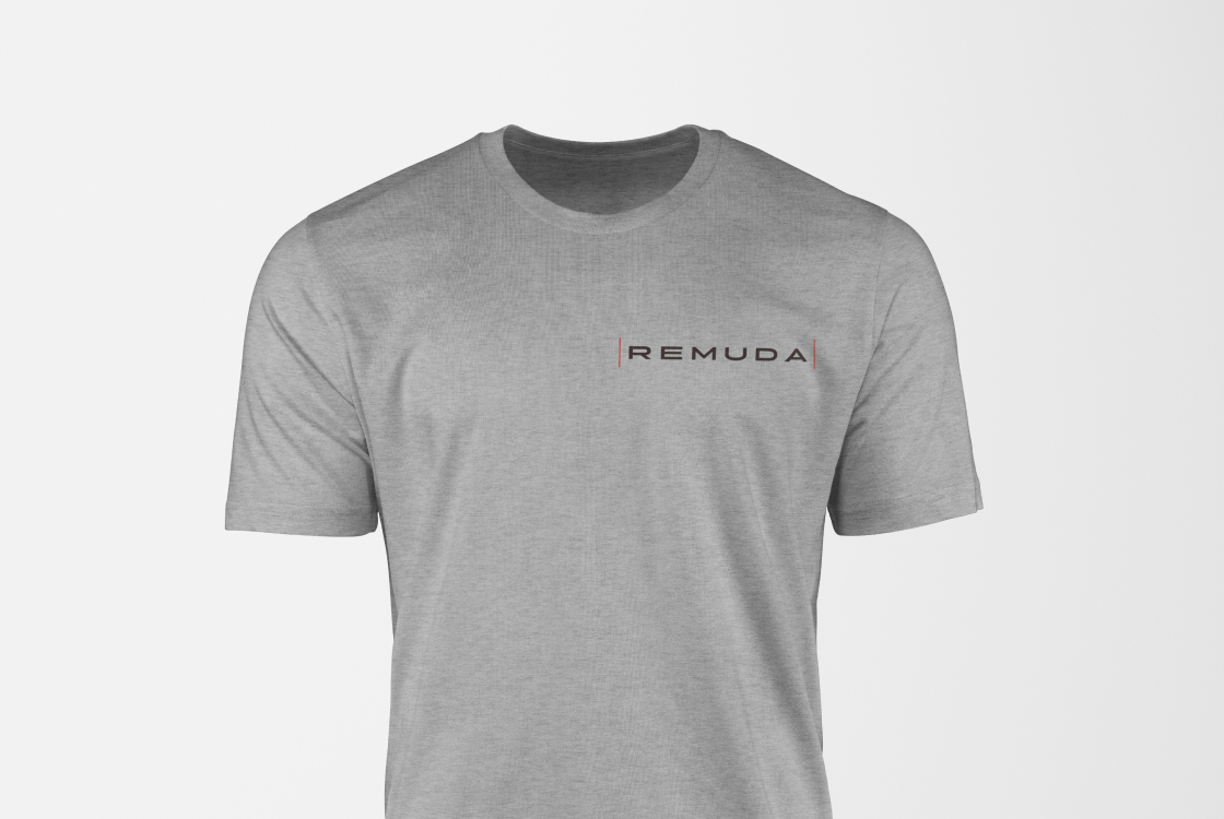
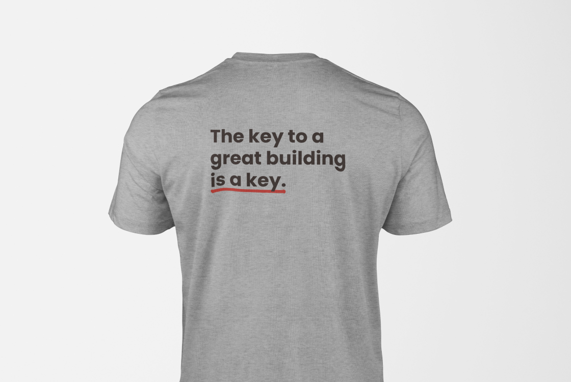
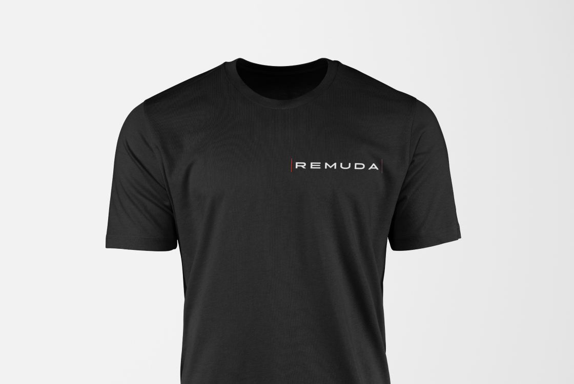
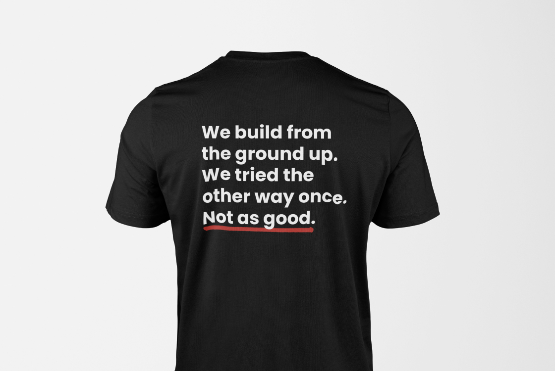
Collateral
Extra-thick business cards, and t-shirts for construction staff with humorous slogans (written by Anders J. Svensson) ensure people won’t forget working with Remuda.
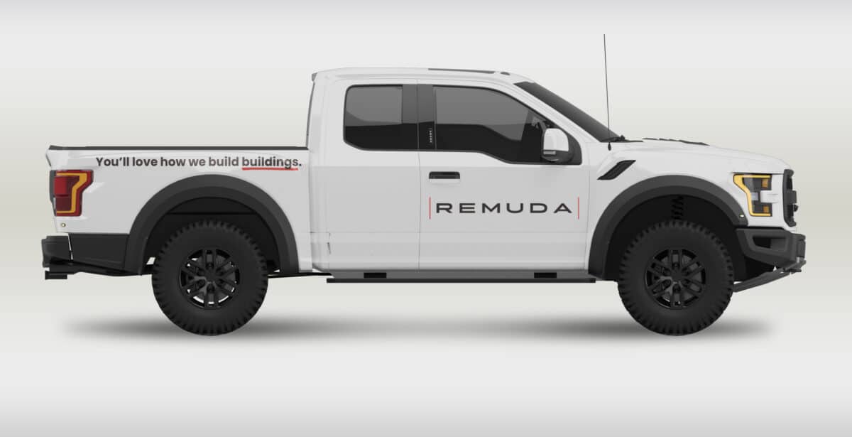
Trucks
Simple, clean and recognizable.
Team
- Art direction: James Jensen
- Design Lead: Chandra Vermeulen, Jessye Cook, Matthew Jacula
- Strategy: Robert Urbanowski
- Writing: Anders J. Svensson
- Development: Motiv Studio
- Project management: Evonne Tran