Tauri
Brand identity and website
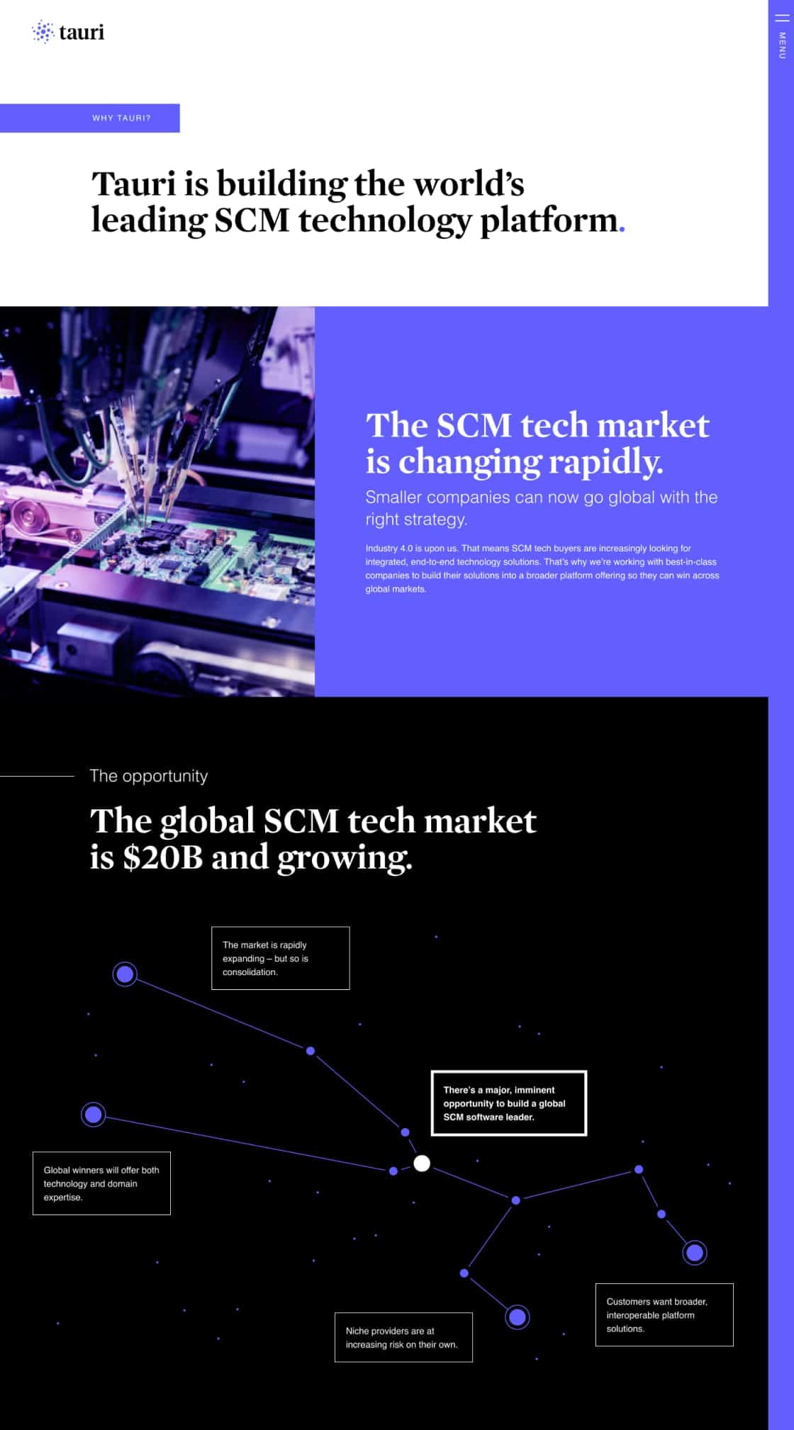
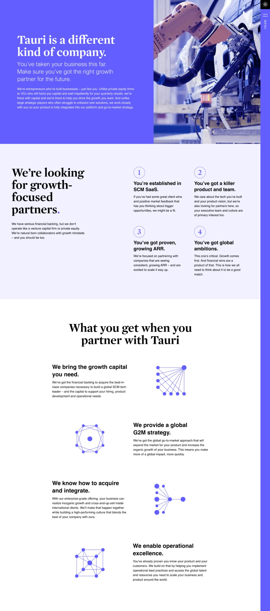
Tauri, an upcoming global leader in supply chain management software, shines bright with a new brand identity and website.
As a start-up with an International reach, we needed a new brand and a website that captured our personality and helped us communicate who we are to partners and clients worldwide. Our challenge – we needed real experts to take a seed of an idea and translate it into a design that aligns with our vision, values and approach in a polished and approachable way.
The Atom Studio team was by far the most organized and efficient creative and delivery team I’ve worked with in a branding and website project. They have the rare ingredients of technical, creative and project management capability to deliver our project on time and on budget. Most importantly, they had the ability to capture and communicate our personality.
The Atom Studio team raised my expectations of the standard one can expect from a brand and website team. I recommend Atom Studio to anyone looking for a creative team with technical chops to help shape a fresh, edgy brand.
Michael Lake
Co-founder, Tauri
Brand Personality
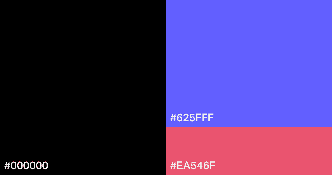
Colours
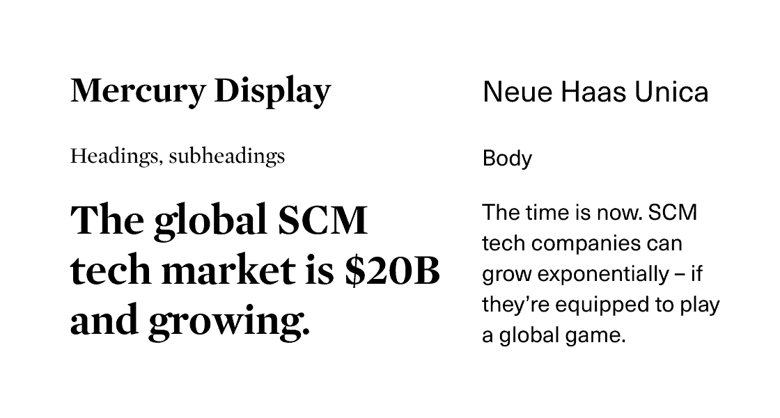
Typography
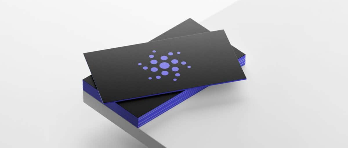
Logo
Website
The Tauri website is the first touchpoint a potential business partner has with the Tauri brand. It is bold, memorable, and speaks directly to the target audience of SCM software entrepreneurs.
Icons
Custom icons based on a dot grid help convey abstract and complex concepts with elegance.

Team
- Art direction: James Jensen
- Brand strategy & copywriting: Ryan DeGama
- Design: Iyla So
- Development: Jennifer Leigh
- Project management: Evonne Tran